Skip to content
Tech

OS X 10.9 Mavericks: The Ars Technica Review

No longer an apex predator, OS X takes some time for introspection.

John Siracusa | 436
Story text
Credit: Aurich Lawson / Thinkstock

After a dozen years and nine major releases, OS X has had a full life: the exuberance of youth, gradually maturing into adulthood, and now, perhaps, entering its dotage. When I am an old operating system I shall wear… leather?

The 2011 release of OS X 10.7 Lion seemed to mark the natural endpoint of the “big cat” naming scheme. But Apple couldn’t resist the lure of the “cat, modifier cat” naming pattern, releasing OS X 10.8 Mountain Lion a year later. Perhaps it just wanted to give its cat nine lives.

The 10th major release, OS X 10.9 Mavericks, is named after an awkwardly plural California surfing spot, finally ending the feline dynasty. But what part of the operating system’s existence is this? The afterlife?

When it comes to OS X, many people are suffering from the end-of-history illusion: the belief that while the Mac platform has consistently experienced significant enhancements in the past, it will somehow not continue to grow and mature in the future.

So let’s readjust our perspective. Perhaps the first seven big-cat releases were OS X’s early childhood: birth, potty training, learning to walk and talk, and so on, culminating in some form of self-actualization.

With Lion, the Mac entered an awkward adolescence, acquiring a newfound concern about what the other kids were doing. Accordingly, OS X’s last two releases included several naked attempts to ape the look and feel of its more successful sibling, iOS.

But that was all before last year’s ouster of Scott Forstall, senior vice president of iOS Software. By all accounts, Forstall was one of the driving forces behind the iOS aesthetic that Lion and Mountain Lion so enthusiastically embraced. Jony Ive's iOS 7 strikes off in a bold new direction based on a philosophy that Apple is eager to generalize to the company as a whole—leaving OS X holding the stitched-leather bag.

An OS out to sea

Let’s say we accept that this is not the end of history and that OS X will continue to evolve. To what end? Aside from undoing the most egregious peer-pressure-motivated interface changes, what should this first non-cat release of OS X do differently from its predecessors?

One option would be to continue to follow iOS’s lead, switching gears from rich textures and simulations of analogous physical products and setting off in pursuit of the new, spare iOS 7 aesthetic. I’ll spoil it for you: Apple hasn’t chosen this path—not yet, anyway. Time and resource constraints alone could explain this choice. After all, Apple didn’t even have the iPad version of iOS 7 ready in time for WWDC this year. An interface overhaul in Mavericks was clearly out of the question.

Mavericks is also not an internals-only release like Snow Leopard, which famously promised “no new features.” There are new features in Mavericks, even new bundled applications.

To some degree, the content of any OS release is determined by what did and didn’t make the deadline for the previous release. There are exceptions, like Fusion Drive, which didn’t quite make it into Mountain Lion but also couldn’t wait for the next major OS release because it was a prerequisite for some new hardware products.

Nevertheless, Apple does try to give each new OS some sort of theme. Mavericks is the first California-themed release of OS X, named after “places that inspire us here in California,” according to Craig Federighi, who says this naming scheme is intended to last for at least the next 10 years. The pressure is on for Mavericks to set a new direction for the Mac platform.

According to Apple, Mavericks has a dual focus. Its first and most important goal is to extend battery life and improve responsiveness. Secondarily, Mavericks aims to add functionality that will appeal to “power users” (Apple’s words), a group that may be feeling neglected after enduring two releases of OS X playing iOS dress-up.

Is that enough for Mavericks to live up to its major-release version number and to kick off the next phase of OS X’s life? Let’s find out.


Table of Contents

Purchase and installation

Lion was the first download-mostly release of OS X, and Mountain Lion was the first download-only release. Mavericks breaks no new ground in the realm of product distribution. As expected, it’s available only through the Mac App Store.

With the transition away from physical media complete, Apple is free to focus on one of the intended benefits of downloadable OS updates: adoption rate.

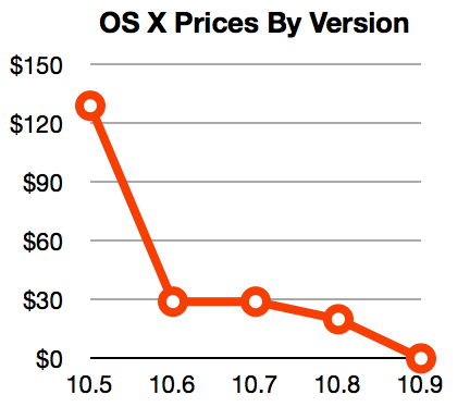
OS X prices, 2007-2013.

At WWDC, Tim Cook made a point of bragging about iOS’s adoption rate. After less than 10 months on the market, 93 percent of iOS users were using the latest version, iOS 6. (iOS 7 is well on its way to matching that performance, with a 64 percent adoption rate 34 days after its release.)

Earlier in the same presentation, Craig Federighi shared some less impressive statistics about Mountain Lion adoption: 35 percent after six months. Did it pass 90 percent four months later? If it did, I imagine Apple would have said so.

After eliminating the trip to the store (or the package delivery), the other major knob Apple can turn to drive adoption of new OS X releases is the price. And turn it has, dropping the price of the Mac operating system steadily over the past five years, hitting $19.99 with Mountain Lion. Mavericks follows the trend to its logical conclusion, finally joining iOS at the magical price point of free. Mac users who are still stubbornly clinging to Snow Leopard are unlikely to be dislodged, but anyone running Lion or Mountain Lion is sure to feel the gravitational pull of an OS upgrade that’s just one click and $0 away.

In a refreshing change of pace, Mavericks does not cut off support for any additional Mac hardware. If your Mac can run Mountain Lion, it can run Mavericks. For completeness, here’s the list of supported models:

Like its feline ancestors, a single copy of Mavericks can be installed on “each Apple-branded computer […] that you own or control” plus two additional copies within virtual machines. There’s still no DRM, no serial numbers, and no product activation. I know I repeat this every year, but it’s worth emphasizing. Despite having arguably built a large portion of its current digital media empire on the back of its FairPlay copy protection system, Apple still seems to view DRM as a net negative that should be avoided, when possible.

Branding

Time was when I’d review OS X branding trends by lining up images of cardboard product boxes or optical discs. After the transition to download-only, Apple’s marketing materials and website must fill the gap. Our first glimpse of Mavericks branding was on a banner visible just before the WWDC 2013 keynote.

Mavericks banner at WWDC 2013. Credit: Pierre Rothmaler

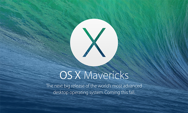
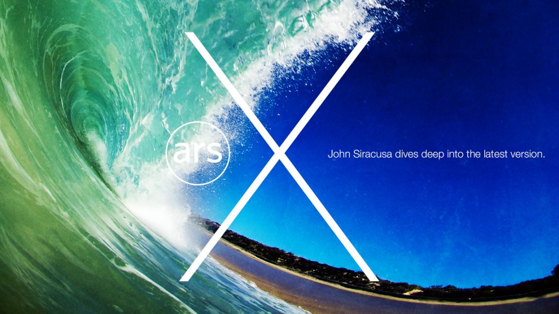
The thin “X” is an obvious echo of iOS 7’s design—despite the fact that, as we would soon find out in the keynote, Mavericks does not adopt the iOS 7 interface style. Apple’s website revealed what would become the more common logo for the OS.

The Mavericks preview section of apple.com.

The “X” is thinner than in the past, but not quite iOS-7 thin. It’s placed inside a circle that initially reads like an optical disc—or does if you’re a Mac user of a certain age, anyway. But sometimes a circle is just a circle. Behind it, showing through the logo, is the attractive new default desktop image showing a wave, presumably from the eponymous surfing location.

I’m mentioning all of this not (just) because I’m interested in how Apple markets its products, but because the branding of Mavericks reveals a tension that appears in both the aesthetic and functional design of the OS itself. Mavericks is not iOS 7, but it’s also not Mountain Lion. Mavericks doesn’t get an all-new interface, but it surely can’t carry on with many of its bundled applications looking like iOS 6 doppelgängers. In the next section, we’ll see how Apple manages this tension.

Interface

At first glance, Mavericks looks like Mountain Lion. There are no major changes to the appearance of standard controls like scroll bars and buttons; the Dock looks the same (in its default position, anyway); most application icons have not changed.

But poke around a bit and you’ll spot a few differences. Move the Dock to the side to reveal its new smoked glass appearance. It’s a nice match for the attractive gray metal look introduced in Mountain Lion, though the smoked glass Dock is translucent instead of reflective like the metal Dock.

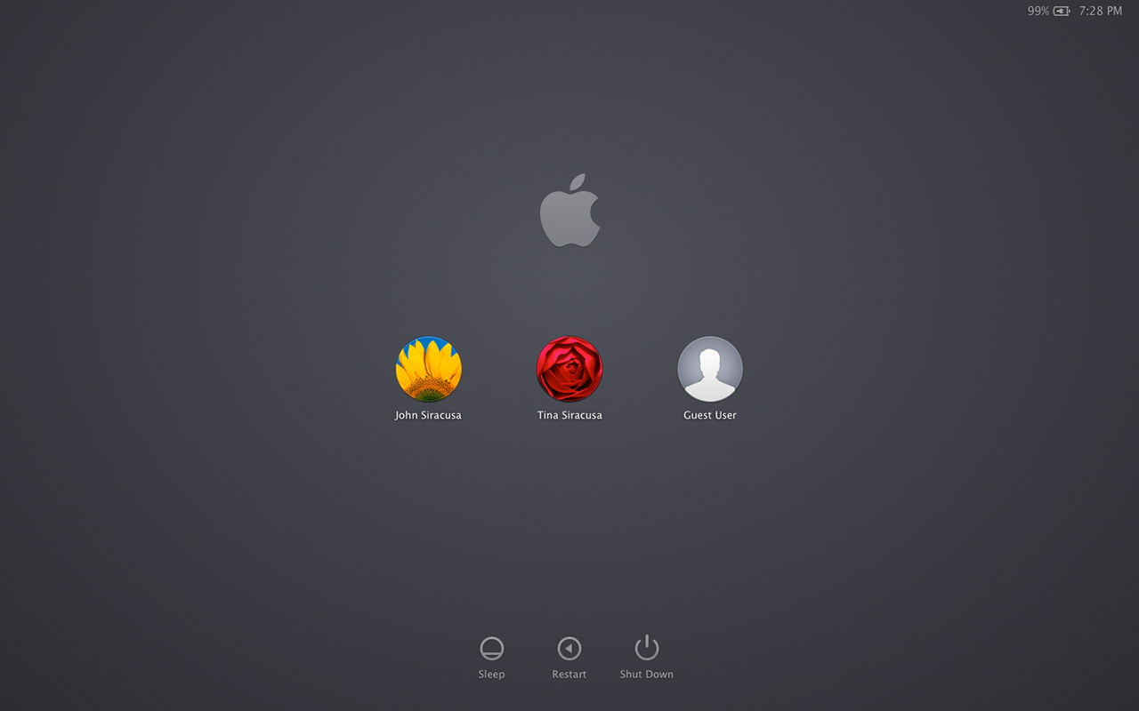
The gray linen texture that invaded OS X in a big way a few years ago has now been expunged. The Notification Center sidebar and the login screen are now a soothing slate gray.

The new linen-free login window.
No linen in Notification Center either.

Linen also no longer covers secondary displays when full-screen mode is active; more on that later.

With these changes, Mavericks can be seen as continuing to follow the lead of iOS 7, which also notably parts ways with the linen texture. But Mavericks is unwilling—or at least unable—to follow iOS 7 the rest of the way down the road. For now, Mavericks has settled for expelling as much visual and interactive baggage from iOS 6 as possible.

Consider the state of the Address Book application in Lion. It was the spitting image of its iOS 6 counterpart on the iPad: a beautifully drawn leather-bound book with a red cloth bookmark. But the artwork was more misleading than helpful. The application looked like a book, but it didn’t behave like one. Worse, important functionality was sacrificed on the altar of those graphics. The third pane used to display contact groups was removed entirely; an open book has two sides, not three, after all.

In Mountain Lion, the newly renamed Contacts application brought back the groups pane, but it did so by cutting into the contact list’s space on the left side of the “book” graphic. Open books must have two equal sides, right?

Mavericks says enough is enough. The leather’s gone, the fake pages are gone, the three panes are independently resizable (more or less), even the title bar is bone-stock, and it’s… boring?

The new look for the Contacts application: cucumbers with cottage cheese.

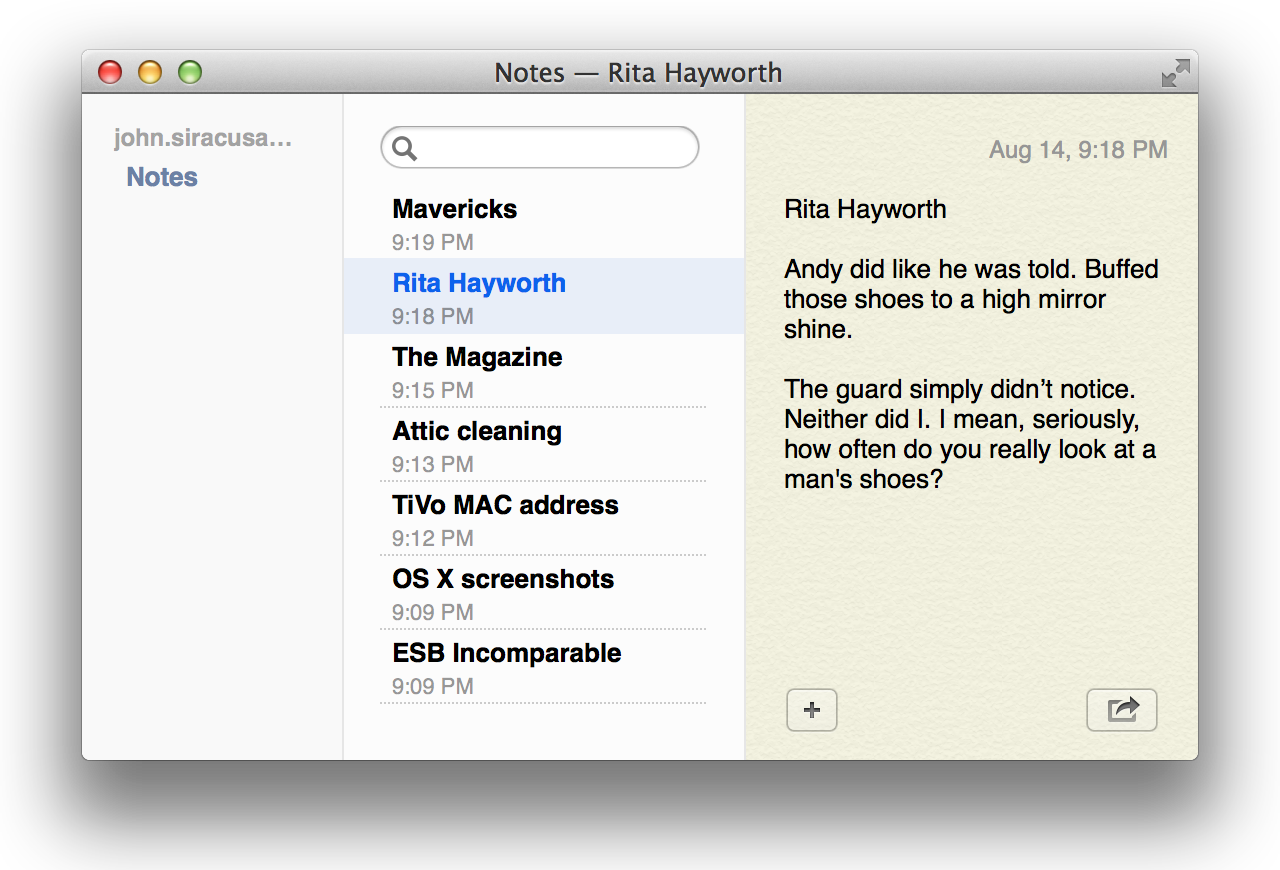
The story’s the same for the Notes application. Once an iOS 6 lookalike sporting torn bits of paper on a yellow legal pad, it’s now stripped of all pretense. Also possibly removed: beauty, fun.

The new Notes applications does not stand out in a crowd.

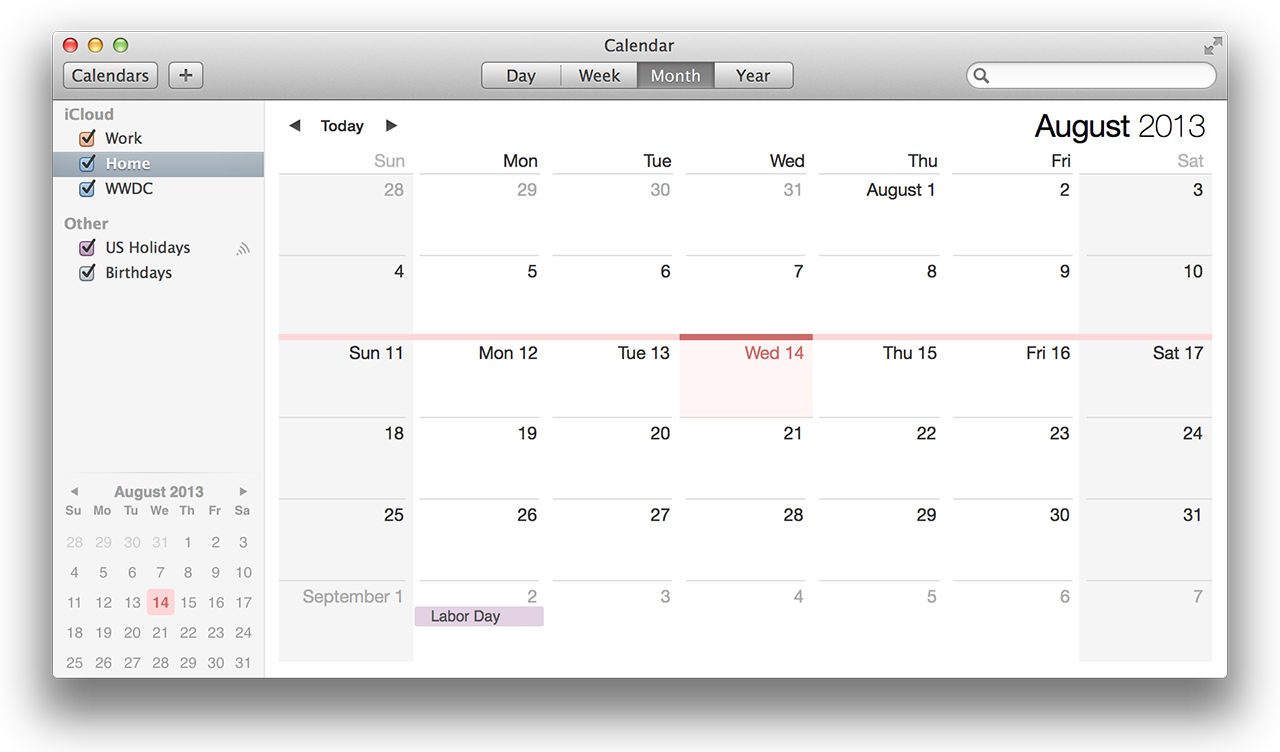
Calendar is straight up the middle, with just a touch of iOS 7’s super-lightweight text (e.g., the year) mingling somewhat awkwardly with the other typefaces.

In Mavericks, gray is the new Corinthian leather.

When Lion was released, here’s what I wrote about its stitched-leather calendar application:

The immediate, visceral negative reaction to the rich Corinthian leather appearance had little to do with usability. What it came down to—what first impressions like these always seem to come down to—is whether or not you think it’s ugly. People will take “really cool-looking but slightly harder to use” over “usable but ugly” any day.

The freshly undecorated applications in Mavericks may test that assertion. Contacts and Calendar look plain compared to their previous incarnations; to my eye, Notes borders on ugly.

Don’t get me wrong, in the case of applications like Contacts, I’m all for excising the misleading graphics and returning the functionality that was removed in service of them. But that kind of surgery appears to be the only significant change to these applications in Mavericks. Apple took the Mountain Lion versions, removed the graphical frills, and updated the UI enough to work correctly without them.

I’m not sure there were any better options given the time constraints. Leaving these applications unmodified would have made OS X look like even more of an old fogey next to iOS 7 than it already does. An OS-wide overhaul (following the iOS lead or not) would have easily pushed Mavericks out into next year, blowing Apple’s annual release schedule. And if an interface overhaul is in the cards for OS X in the next year or two, a fresh rethinking of each application within the constraints of the current OS X look might have been wasted effort (in addition to making Mavericks late).

And yet there are places where hints of iOS 7 peek through. The icon for the new Maps application, for example, looks like an OS X-style application icon with iOS 7’s color palette and smooth gradients applied to it. The iBooks application icon takes this look one step further. The new iCloud preference pane icon looks like a straight lift from iOS 7.

Maps, iBooks, and iCloud have icons that show more than a little of iOS 7’s influence.

You might expect the Calendar, Contacts, and Notes icons to have been revised in the style of the new Maps icon to reflect their newly chastened interfaces. Nope, no time for that either, I guess.

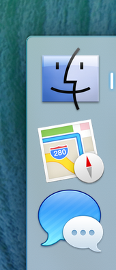
These applications have changed, but their icons still reflect their pre-Mavericks interfaces.

Many applications haven’t been modified at all in Mavericks. Game Center retains its tacky green felt and wood. Reminders still looks like textured black… something surrounding white note paper. Messages still sports glossy text bubbles.

The influence of both iOS 7’s “frosted glass” header elements and the sadly misguided translucent OS X menu bar can be felt in the new list-view headers in the Finder.

In what situation is it important to see the App Store application peeking through the header?

I can think of only one practical use for this effect: to indicate that there’s more content above the current scroll position when no scroll bar is visible to communicate this information. At all other times, this transparency only serves to slightly impair the readability of the column headers.

And then there’s the crazy sparkle effect that appears around newly installed applications in Launchpad.

Apps, exciting and new…

The same effect is used when a new Dashboard widget is installed. I’m tempted to say this is no more gaudy than the water-ripple effect used when a new instance of a widget is placed on the Dashboard, but in the context of the overall trend away from ostentatious ornamentation across Apple’s product line… yeah, it does seem a little worse.

In short, the look and feel of Mavericks is a mixed bag. The iOS-inspired interface divergences introduced in Lion and refined in Mountain Lion have been partially rolled back in Mavericks, but there’s still much more to be done. I look forward to the day that the OS X interface will finally stop backtracking and start moving forward again.
Safari

The most important changes to Safari in Mavericks are internal. Two years ago, Lion included a version of Safari based on the WebKit2 engine, which rklrated the task of page rendering and JavaScript execution into an external process, mostly for security reasons.

WebKit2 was a reaction to Chrome’s multi-process architecture, which uses multiple WebKit processes to handle page rendering. Google included the multi-process code in the Chromium project, not in WebKit. Before creating WebKit2, Apple asked Google if it was willing to contribute Chromium’s multi-process code to the WebKit project. Google declined, leaving Apple to create its own solution. Apple implemented its multi-process system in the WebKit engine itself, benefiting any application that uses WebKit.

Unfortunately, the WebKit2 era of Safari has been marred by chronic instability. When Safari’s lone back-end Web rendering process gets wedged, users are greeted with the all-too-familiar “webpages are not responding” dialog; forward progress requires reloading every open webpage in every tab in Safari. This problem has not gone away in the years since Lion was released.

Contrast this to Google’s Chrome browser, which has been rock-solid over the same period. The cumulative effect of these years of Safari instability has made me start to question whether Apple still has the chops to keep up in the fast-paced world of Web rendering engines.

Safari version 7, included in Mavericks, is Apple’s answer. It sports a new process-per-tab architecture, finally following in Chrome’s footsteps—though this change is part of WebKit itself, not just the Safari application. It’s too early to tell if this change will restore Safari’s stability, but I can report that I have not seen a single Safari crash or “webpages are not responding” dialog in all my Mavericks testing. (I’ve seen many in Safari 6 while writing this review in Mountain Lion.)

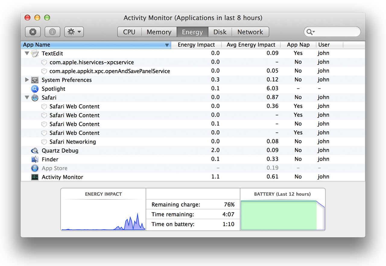
The new architecture also affords the ability to examine the behavior of individual browser tabs using the Activity Monitor application.

At last, separate Safari Web Content processes for each tab.

It would be nice if this feature was built into Safari itself, like Chrome’s Task Manager, so each “Safari Web Content” process could be linked to a specific open tab without leaving the application. As a fallback, hovering the cursor over a Safari Web Content process in Activity Monitor will reveal the URL of the website being rendered.

Safari takes another page from the Chrome playbook by delaying the resizing of tabs after a tab is closed. Clicking the “x” button on a tab to close it and then clicking repeatedly on that same spot without moving the cursor will close all the tabs to the right of the original tab. The imitation is not perfect, however. Safari resizes the remaining tabs once all the tabs to the right of the original tab are closed. Chrome takes the extra step of resizing the tabs to the left of the original tab, placing their close buttons beneath the cursor as well, when possible—something for Apple to add to Safari 7.1, perhaps.

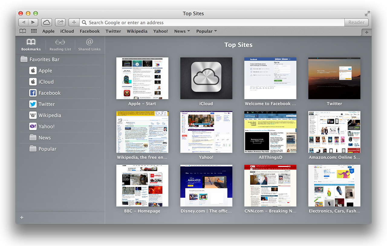
Safari’s first-run experience reveals most of its new user-visible features. The old Top Sites, a concave pseudo-3D wall of website thumbnails, has been replaced by a plain, flat grid of thumbnails. The old Reading List sidebar has been replaced by a unified sidebar containing Bookmarks, Reading List, and a new feature called Shared Links.

Safari’s new sidebar and less flamboyant Top Sites layout.

Shared Links shows links from the social network accounts added through the Internet Accounts preference pane. For example, if a Twitter account is registered, Shared Links will show only the tweets that contain links.

Reading List gets a mild facelift to fit in with the new sidebar styling. Two-finger swiping past the bottom of the page when viewing an item from the Reading List loads the next item in the list. It’s as if all items form a single, long webpage.

The old bookmarks manager and history viewer are still available via separate items in the Bookmarks and History menus, respectively. Editing bookmarks in the new sidebar is frustrating (the interface is made for navigation, not modification), so don’t forget about the old interfaces.

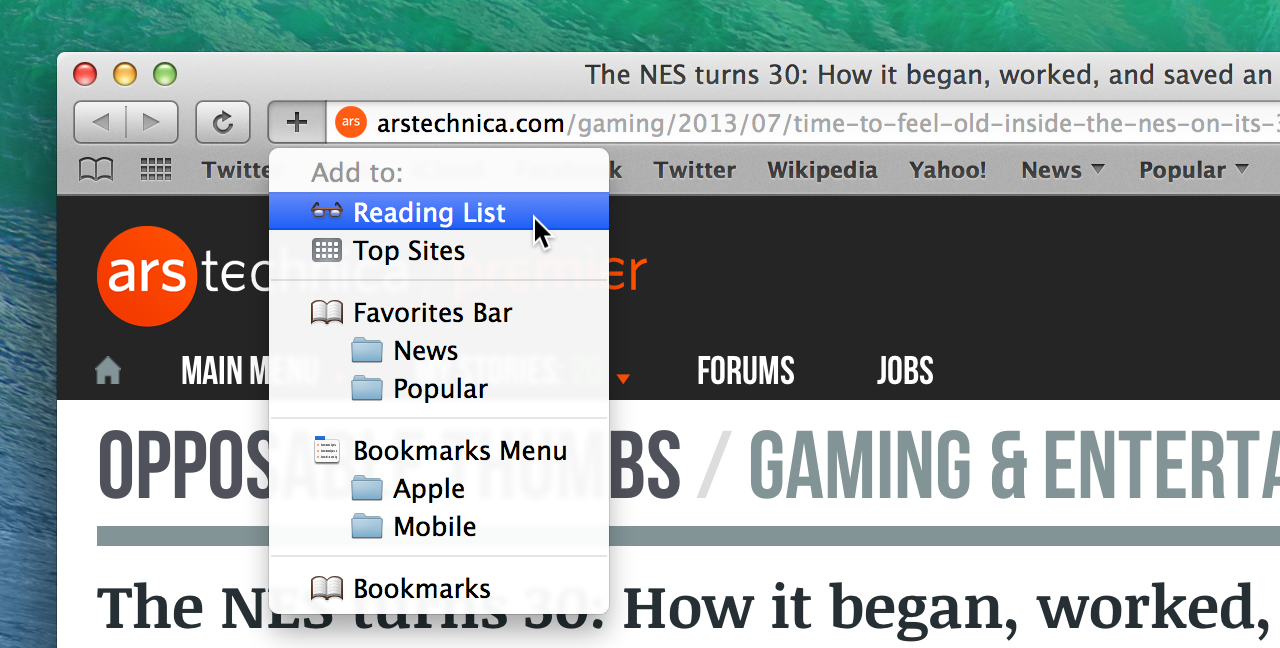
After a brief absence, the “+” button has returned to its former home nestled in the left side of the address bar. There is no separate incarnation of this button that can be placed anywhere on the toolbar, nor is there an option to remove it from the address bar. Holding down the mouse button (but not right-clicking) on the “+” button reveals a menu for adding the current webpage to all of Safari’s various link storage locations.

The “add” button is here to stay in Safari 7, but at least it knows a few new tricks.

While the additional functionality is welcome, I’m not sure the frequency with which people add bookmarks, Top Sites, or Reading List items warrants such prominent, permanent placement for this button.

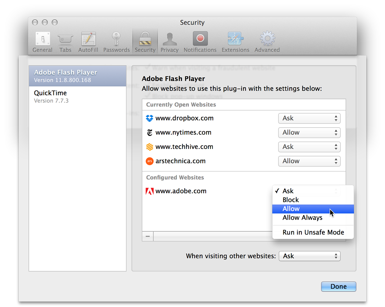
Browser plug-ins can now be managed on a per-website basis, with five options: Ask, Block, Allow, Always Allow, and Run in Unsafe Mode. The same options exist for the default behavior when visiting a new website. The preferences window conveniently splits the list of websites into those that are currently open in Safari and all the rest.

Safari’s new per-site, per-plug-in security settings.

Even when set to “Allow” a plug-in, Safari will block it if there are known security issues with the installed version of that plug-in. (Updated plug-in security information is automatically distributed to all network-connected Macs using the same mechanism as the existing malware signature information.) The “Allow Always” setting overrides this restriction, permitting plug-ins to load even if they have known vulnerabilities.

Most popular plug-ins run in a sandbox by default, including QuickTime, Flash Player, Silverlight, and Oracle’s Java plug-in. The “Unsafe” plug-in setting instructs Safari to run the plug-in outside the sandbox. This is intended as a last resort for plug-ins that don’t yet run correctly inside a sandbox. (This setting also allows plug-ins to load despite the existence of known security problems with the installed version.)

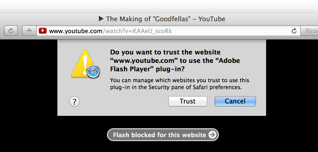
The “Ask” setting is the default when visiting a new website. It presents a sheet with options to trust, block, or disallow for now (but ask again later).

When configured to “Ask” about plug-ins on the first visit to a website, Safari presents these options.

Blocked plug-ins are reported as such in the browser window. Clicking on the blocked plug-in message will ask for confirmation before allowing it to load.

Click to load this plug-in…and all other instances of the same plug-in on this website.

Clicking the “Trust” button doesn’t just allow this particular instance of the plug-in to load. It changes the setting for this plug-in for the entire website to “Allow.” This is unlike the once-popular ClickToFlash in which clicking on a particular instance of a plug-in did not confer website-wide permission to load that plug-in in the future.

Like last year’s Gatekeeper feature, Safari’s new plug-in security settings have sensible defaults while also offering an easy way to opt out. Automatically disabling plug-ins when vulnerabilities are discovered will likely annoy users a lot more than Gatekeeper does, but it’s preferable to the alternative of leaving users exposed until they realize there’s a problem and upgrade on their own—a sequence of events that represents a surprisingly high hurdle for most users. After all, most people don’t read tech news on a regular basis, scanning for the latest Flash or Java exploits.

There’s also a new preference to “Stop plug-ins to save power,” which is part of a feature Apple calls Safari Power Saver. Even if the preference for a website is set to “Allow,” the Power Saver feature will stop plug-ins from running if they do not appear to be the main content on the page.

Translating that from abstract to concrete, it means that you can enable Flash for a website and Safari will still try to block auto-playing Flash ads that appear around the content on that website. There’s no visible indication that it’s happening until you mouse over one of the frozen ads.

Safari Power Saver in action: a Flash sidebar ad loads, but it’s not allowed to run until clicked.

Safari uses a fuzzy set of rules to distinguish plug-in “content” (e.g., the movie trailer you came to the website to see) from extraneous items that should not be allowed to auto-play (e.g., sidebar or banner ads). In practice, it works well. Credit the banal predictability of ad-heavy website layouts and ad banner sizes.

The default Web browser is an incredibly important part of any modern operating system. Though we geeks may routinely install alternate browsers, application download and installation on OS X is not yet as simple as it is on iOS. (It also doesn’t help that popular alternatives like Chrome and Firefox aren’t available through the Mac App Store.) Safari is “the Web” for most Mac users; it needs to be awesome.

Apple clearly realizes this, as it continues to pour resources into Safari in release after release. Safari 7 is a standard-bearer for many of the flagship technologies in Mavericks, and its focus on stability, security, and energy-saving is a microcosm of the whole OS. I came very close to switching to Chrome as my default Web browser during the reign of Safari 6. Safari 7 has pulled me firmly back into the Apple camp.

iCloud Keychain

Few lamented the end of MobileMe. Apple’s much-maligned package of network services was in trouble from day one, and it never became the beloved, essential product that Apple envisioned. When iCloud was introduced in 2011, it was welcomed as a liberator.

The transition from MobileMe to iCloud was not without its pitfalls—and losses. The end of support for Apple-hosted websites produced the biggest short-term turmoil, but the writing had been on the wall for the iWeb application for years.

Passwords, on the other hand, are (sadly) not going away any time soon. MobileMe’s Keychain synchronization feature was one of the highlights of the service for me. To replace it, iCloud offered exactly nothing. This was an ongoing pain, becoming worse as the Keychain databases stranded on each isolated Mac slowly diverged from each other.

In Mavericks, blessed relief is just one checkbox away.

The new iCloud Keychain isn’t exactly the same as MobileMe’s Keychain sync. Rather than synchronizing the entire contents of the Mac’s Keychain database, Mavericks adds a new “iCloud” keychain alongside the local “login” and “System” keychains.

iCloud gets its own separate keychain.

If the iCloud Keychain is subsequently disabled, the iCloud keychain highlighted in the screenshot above is replaced with a “Local Items” keychain that has the same contents as the iCloud keychain. Any items added to the Local Items keychain will be pushed out to other devices when iCloud Keychain is re-enabled.

Enabling iCloud Keychain requires traversing a gauntlet of security-related questions rivaled in OS X only by the recently revised FileVault disk encryption feature. It starts with a suggestion to enable a screen lock, if one is not already enabled, to prevent someone from walking up to your unattended Mac and having access to all your cloud-synced passwords.

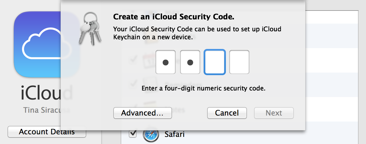
Heed Apple’s advice (or click “Not Now”), then enter your Apple ID password to continue. Next, you’ll be asked to create an “iCloud Security Code.” The default dialog requests a four-digit numeric code, but the “Advanced…” button leads to more options.

iCloud Security Code setup: 4-digit numeric, or…
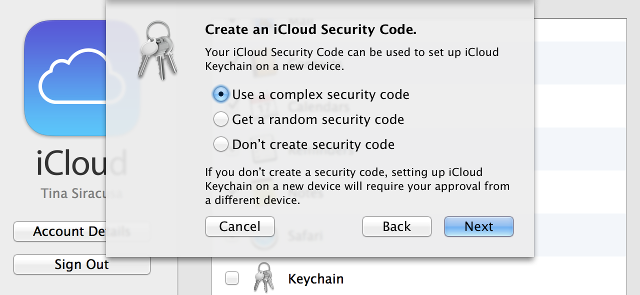
iCloud Security Code “Advanced” options, including no security code at all.

You can forgo a security code entirely, ask to be prompted for a “complex” security code (i.e., a password instead of a 4-digit code), or ask Mavericks to generate a random security code. Random codes look a lot like FileVault recovery keys (e.g., DCLK-XZEX-XNEB-LGXJ-5UHB-89C3). The “complex” and “random” security code dialog boxes also suggest that people write down their security codes and keep them “in a safe place” because “Apple cannot recover a lost code.”

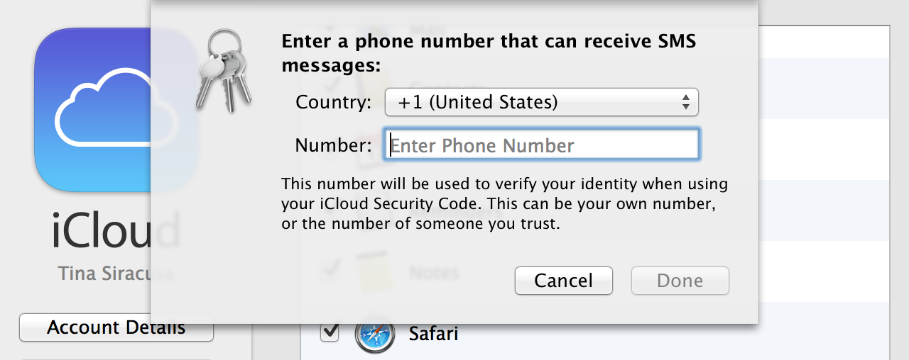
Finally, if you didn’t opt out of the security code entirely, you must enter a phone number that can receive SMS messages.

At last, the final step: a phone number to receive verification codes from Apple via SMS.

There’s also a first-run setup wizard that will take new users through the same steps before logging in for the first time.

All of this additional security comes into play when you want to enable iCloud Keychain on a second device. At that point, you have two options. You can request approval from another device where iCloud Keychain has already been enabled for the same Apple ID. This request appears in the form of a standard notification dialog.

Approval from a trusted device is one way to activate iCloud Keychain on another Mac.

If you choose to configure an iCloud Security Code, you can enable iCloud Keychain on a new device by entering all three of the following: your Apple ID password, your security code, and a verification code that Apple will send to the configured phone number via SMS.

Usability and security are often at odds with each other. iCloud Keychain bears this out, presenting many more hurdles during the setup process than the MobileMe Keychain sync feature that it belatedly replaces.

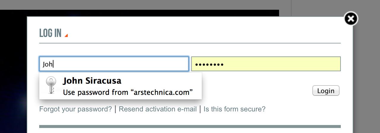
Once configured, it mostly works as expected, helpfully offering to remember usernames and passwords in applications like Safari, syncing them to all configured devices, and then auto-completing those values when they’re requested later.

Safari’s Keychain auto-fill, now powered by iCloud.

Safari’s iCloud Keychain integration goes further, offering to auto-generate and then remember passwords for the user.

Accepting the suggested password will also helpfully enter it in the password confirmation field as well. Interestingly, Apple’s own Apple ID account creation website ranks the strength of the auto-generated password as merely “moderate.”

Apple is not impressed by its own password suggestions.

By default, auto-fill still refuses to activate on websites that explicitly ask to disable the feature. Again, the tension between usability and security surfaces. Digging into Safari 7’s preferences reveals a setting that promises to “[a]llow AutoFill even for websites that request passwords not be saved.” Jackpot! But there are caveats. First, enabling this override requires that the Mac be configured to lock the screen when idle. Second, Safari still fails to auto-fill passwords on some websites, most notably Apple’s own icloud.com.

For people with more complex needs, third-party password managers still fill an important role. Similarly, the people for whom “cross-platform” means more than just “OS X and iOS” will continue to rely on the password management and sync features built into Chrome and Firefox.

For everyone else, things are looking up. An Apple-made password manager that’s built into the default Web browser on OS X and works across multiple Macs and iOS devices was long overdue. It’s sure to be a hit among people who—rightly—expect this functionality to work without any third-party software.

Notification Center

Notification Center has become such an integral part of my daily use of OS X that I just spent a few moments searching my review of Lion for the word “notification” before realizing that Notification Center was actually introduced just a year ago in Mountain Lion. I’d say the feature has handily earned its place in the upper-right corner of the screen, even if most of my interaction with it is through the preference pane and the various alerts and banners that appear during the day.

Mavericks takes the obvious next step and adds the ability to reply to a notification right from the alert itself. This only works for a handful of Apple-supported applications right now (e.g., instant messages using the Messages application, e-mail using Apple’s Mail application) but the supported services have broad coverage: Facebook, Twitter, FaceTime, e-mail, instant message, calendar events, and reminders.

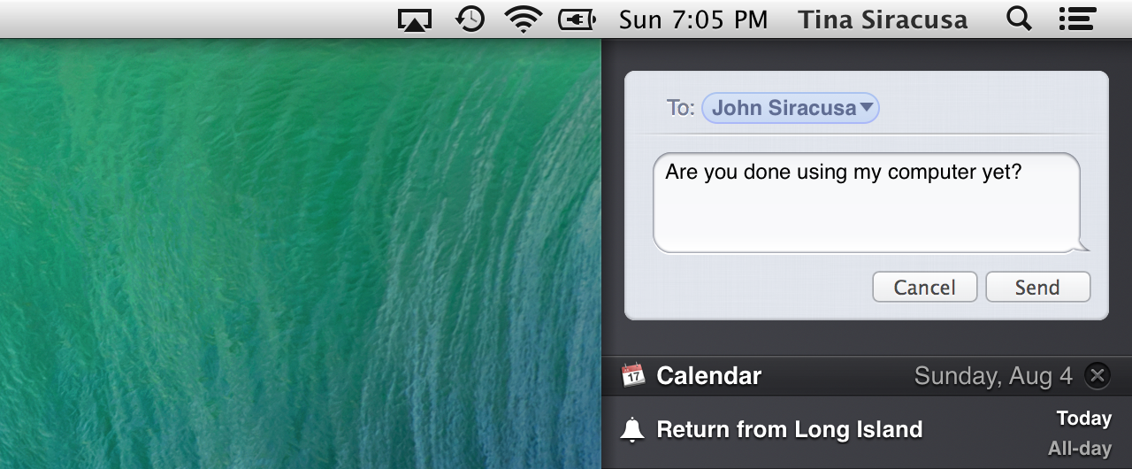
Simple, text-only replies can be sent directly from a notification alert using an inline user interface.

Replying to an instant message from within the notification.

The reply button on e-mail notification alerts will launch the Mail application and prepare a reply. Despite the potential sophistication of an e-mail message (attachments, styled text, and so on), an inline e-mail reply interface would be a nice option. Maybe next year.

Cross-protocol replies are a pleasant surprise. An invitation to a FaceTime video chat offers an inline instant-message reply option with a configurable set of canned answers (or freeform text), plus an option to add a reminder to get back to the person later. The reminder will include a link to initiate a FaceTime chat with the person.

FaceTime requests can be replied to with an instant message or by creating a reminder to contact the person later.

Instant messages can also be initiated from that weird little area at the top of the Notification Center sidebar. It’s getting pretty crowded up there. There’s probably room for one more service icon before things start getting silly.

Send an instant message, tweet, or share something on Facebook or LinkedIn from the top of Notification Center.
Sending an instant message from Notification Center.

Each type of notification now has an option (on by default) to display even when the screen is locked. Notifications that may contain sensitive information, such as e-mails or instant messages, have an additional option to show message previews only when the screen is unlocked (the default), or always.

New privacy-related notification preferences.

These defaults are reasonable, but people who rely on screen savers for “casual” privacy in shared spaces may not want even the names of the people who are e-mailing and instant-messaging them to appear on their unattended screens. As always, the price of Notification Center satisfaction is eternal vigilance.

Though Safari in Mountain Lion linked Web notifications to OS X’s native notification system, I’ve encountered few websites that take advantage of this feature. It only works when a website is open in a Safari window, so admittedly, its usefulness is limited.

Mavericks allows websites to use Apple’s Push Notification service to post updates even when Safari isn’t running. This is a feature I really hope more websites adopt, though its confinement to a single platform surely makes it less appealing.

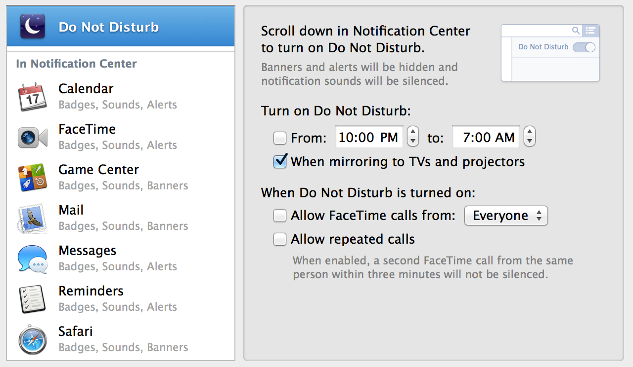
Finally, the big on/off switch at the top of the Notification Center sidebar has been rebranded as Do Not Disturb and has been given a generous helping of preferences.

Notification Center’s Do Not Disturb feature now has a full set of preferences.

The part of me that Apple’s beautiful, terrible walled garden has not yet stamped out of existence still yearns for a more open notification system that would allow third-party applications to enjoy the same interface integration as Apple’s “blessed” applications for each service. (I use Adium for instant messaging, Twitterrific for Twitter, and Gmail for e-mail.) But overall, the notification system in Mavericks is a comfortable improvement over its initial incarnation in Mountain Lion.

The Finder

It’s not fair to say that Apple has entirely neglected the OS X Finder. It’s been extensively revised multiple times over the years. It was even “rewritten” in Cocoa when Apple finally left Carbon behind for good a few years ago. Every major release of OS X includes some changes to the Finder.

But even as Apple has regularly laid hands on the Finder codebase, the application has continued to suffer from a kind of spiritual neglect. My own decade-long frustration with Apple’s refusal to cleanly separate the “browser” features of the Finder from the rest of its functionality may (still) seem academic and unimportant to most Mac users (though they are wrong). But more broadly speaking, it’s clear that the OS X Finder is far from the center of the Mac experience that it once was back in the days of classic Mac OS. With the introduction of Launchpad in Lion, the Finder seems poised to become even less relevant in the future.

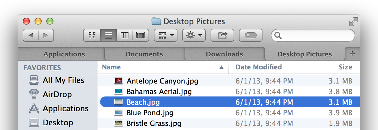
Given all of this, perhaps we’ve been lulled into a false sense of complacency where the Finder is concerned. Then along comes Mavericks and, suddenly, the Finder has tabs.

Tabbed browsing in the Mavericks Finder. The wait is over.

Tabs! Can you believe it? This is such an obvious feature that entire third-party products have been developed to fill the gap. Why didn’t the Finder get tabs sooner? Was there some sort of philosophical objection to them? Did they conflict with the grand vision of the OS X Finder? Does such a thing even exist?

So many questions. No matter, tabs are here now, so let’s move on. They look and work almost exactly like Safari tabs. They can be rearranged by dragging, torn out to form new windows, and moved from one window to another. Holding down the command key while double-clicking a folder opens it in a new tab. (There’s a preference to turn this off, in which case command-double-clicking opens a folder in a new window.) Files and folders can be dragged and dropped onto a tab in any window to move or copy them. The proxy icon next to the folder name in the window title bar can be dragged onto the “+” icon in the tab bar of another Finder window to add a new tab with that location.

Since it’s nearly impossible to add a major new feature to the Finder without further complicating the interaction between “normal” and “browser” Finder windows (browser windows are the ones with toolbars), please note that it’s now impossible to hide the toolbar on a browser window that has two or more tabs. Non-browser Finder windows don’t have tabs, and apparently Apple couldn’t decide what to do with the tabs when “transforming” a browser window into a normal window.

Of course, that transformation is at the very heart of the Finder’s schizophrenic/amnesiac persona, leading to similar questions about other aspects of window state such as size, position, view style, and so on, which is why such window transformations shouldn’t be possible at all, under any circumstances. But I digress.

With the addition of tabs, the idea of a full-screen Finder window is a lot more attractive. Happily, the upper-right corner of each Finder browser window sports a full-screen widget that does just what you’d expect.

Full-screen support and tabs would easily fulfill the low expectations for Finder changes in a major OS X update, but Mavericks has one more thing…

Tags

At first glance, it appears that Finder Labels have been renamed “Tags” in Mavericks. Sure enough, the menu items and preferences in the Finder use the word “Tags” everywhere and “Labels” nowhere. The visual treatment of labels in the Finder’s various views has also changed. Instead of highlighting the entire file or folder name (or the entire row, in list view), a colored dot is displayed next to the name.

Finder Tags display: colored dots replace Mountain Lion’s whole-row highlights.

Setting aside everything else that is to come regarding Tags, this change alone finally resolves the visual confusion caused by the line-highlighting appearance of labels introduced in Panther 10 years ago.

Stay in the Finder a bit longer and you’ll undoubtedly discover that Tags are not quite the same as labels. Attempt to change a file’s Tag from blue to green, for example, and the UI will gently explain what’s about to happen.

Multiple Tags can be applied to a single file.

When an item has multiple Tags, the Finder will show multiple overlapping dots, up to a maximum of three, showing the three most recently applied thereafter.

Multiple Tags as displayed in the Finder: the three most recent Tags are shown as dots.

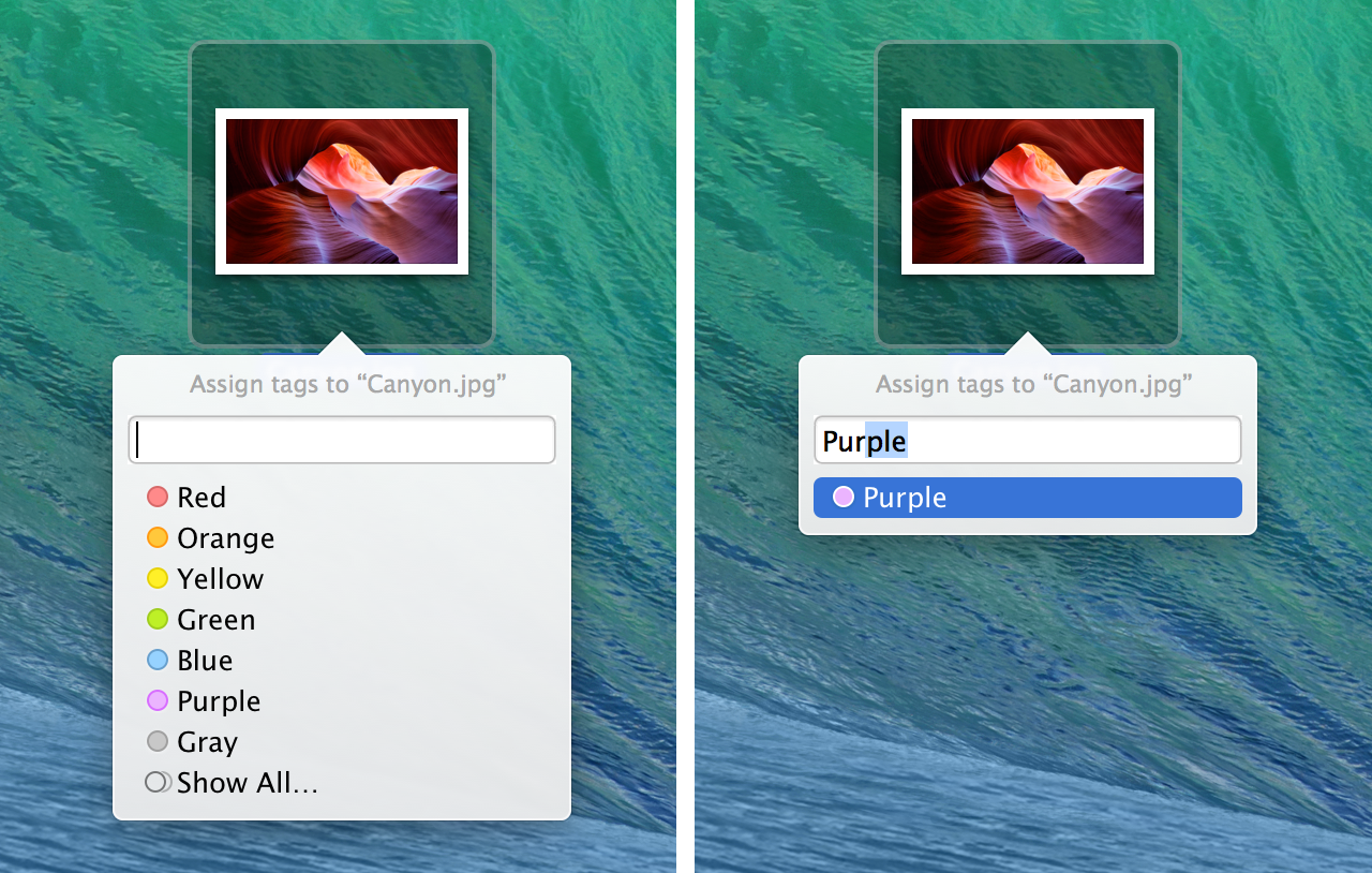
Careful observers will note that the text “Label:” that used to appear above the row of colored dots in the Finder’s context menu has been replaced with “Tags…” in Mavericks. As always on the Mac, that ellipsis denotes a menu item that leads to a further prompt for input. Select it and a popover appears, featuring a list of colored dots along with a text input field. (The same functionality can be triggered using the “Edit Tags” Finder toolbar item or the “Tags…” menu item in the File menu.)

Go ahead and type. If the text matches an existing Tag name, hitting the return key will add the Tag and return the insertion point to the text field, now including the newly added Tag.
The Finder Tags popover: add an existing Tag by clicking on it or typing its name.

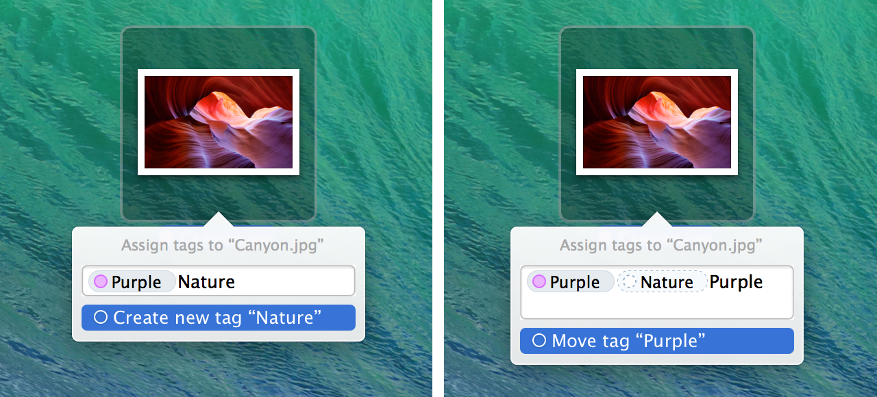
Type something that does not match an existing Tag and hit return to create a new Tag. Enter the name of a Tag that’s already added to the file and the Tag will be moved to the end of the list of Tags.
The Finder Tags popover: create a new Tag or move an existing Tag.

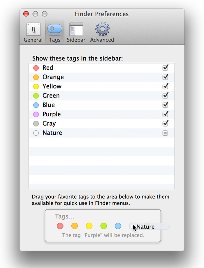
The “Tags” section of the Finder’s preferences window offers a way to assign colors to newly created Tags—though it’s not immediately obvious how. (The answer: click the circle to the left of the Tag name.) There are only seven colors to choose from, and they can’t be changed. More than one Tag can use the same color.

The devious puzzle box that is the Finder’s Tags preferences.

There’s also a confusing drag-and-drop area at the bottom of the window. Though the text above it tries to explain how it works, the lack of labels on the colored dots at the bottom is confusing.

That horizontal line of colored dots represents the list of Tags shown in the Finder’s File menu and context menu. Mouse over each dot to see the name of the Tag that it represents. Do what the text above the dots says and drag a Tag from the top list onto the bottom row and yet more text appears to explain what will happen when you release the mouse button and complete the drag operation.

Frankly, this entire window is a user-interface disaster. And we haven’t even mentioned the checkbox to the right of each label. Can you guess what those do? (No, there’s no tooltip when you hover over one.) I’ll spoil the surprise. When that box is checked, it means the Tag appears in the Finder sidebar; unchecked means it doesn’t.

And still, more mysteries remain. Just try to guess what an indeterminate checkbox (i.e., one with a horizontal line in it instead of a check mark) is meant to indicate. (No, still no tooltip on hover!) Give up? I almost did. Here’s what it means.

When a Tag that has never been added to any file before is added to a file for the first time, that Tag automatically appears in the Finder sidebar (at the very top). But since the user didn’t explicitly ask for that to happen, the preferences window doesn’t show a check mark in the checkbox; it shows the indeterminate marker instead.

You were just about to guess that, right? Thankfully, the fate of the OS—or even just the Finder—doesn’t hinge on this one preferences window. But good gravy, is it ever a mess.

The rest of the Finder’s integration of Tags is smoother. Selecting a Tag in the Finder sidebar runs a Spotlight search for all files with that Tag. (As far as I can tell, there is no way to select multiple Tags in the sidebar; use a full Spotlight search to find files with any or all of a set of Tags.) Drag the Tags in the sidebar to reorder them.

When a Tag is selected in the Finder sidebar, dragging a file into that window will add the selected Tag to the file (which will in turn make the file match the search criteria and appear in the window).

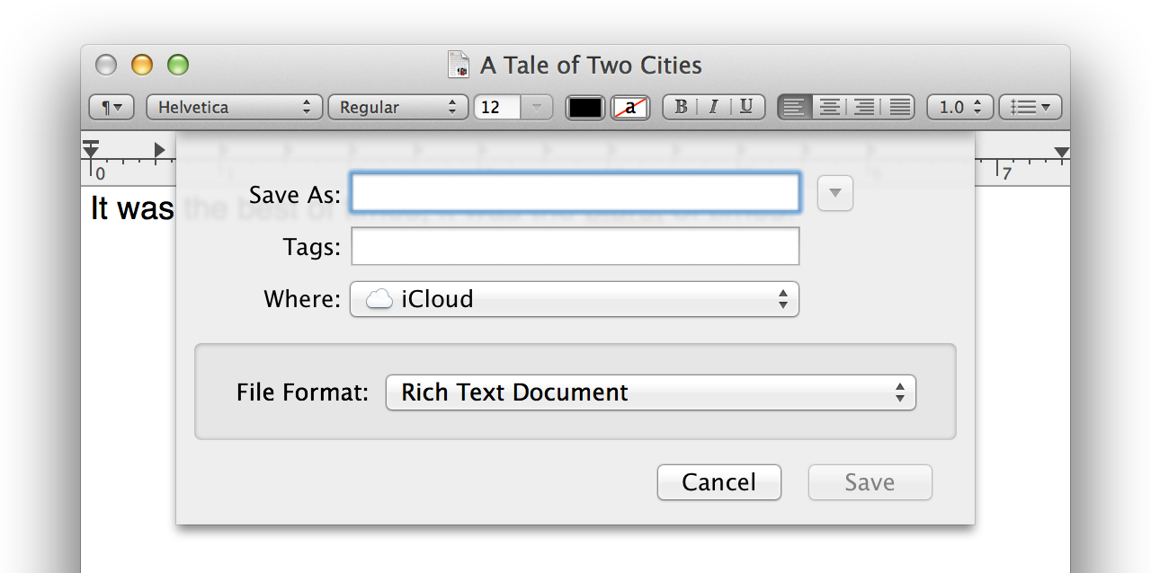
As usual, the same sidebar appears in open/save dialog boxes. The standard save dialog also includes a new field for entering or modifying Tags. This is convenient, but it may also be confusing for some people. When the Tags field is empty, it looks exactly like the file name field that’s directly above it.

Add tags when saving a document—just make sure you enter them in the correct field.

I’ve done a double-take several times when saving documents in Mavericks due to this “clone” text field. It’s all too easy for me to picture a less experienced user trying to type a file name into the Tags field and not understanding the subsequent error messages.

Tags are also editable using the title bar pop-up menu introduced in Lion for document versioning.

Move over, versions. Tags now get pride of place in the title bar pop-up menu.

The old “Move To…” command has been replaced with a pop-up menu containing iCloud folders, favorites, devices, and recent destinations, with an “Other…” item at the bottom. The document-versioning features that used to live in the title bar pop-up menu remain accessible via the File menu’s “Revert to…” submenu.

Tags implementation

File system metadata in OS X has had an extremely bumpy road. The folks from NeXT wanted no part of the metadata inherited from classic Mac OS for both philosophical and technical reasons. Their proposed replacement: nothing.

That’s all ancient history now. We may still be stuck with the practice of encoding file type information in the file name like a bunch of animals, but in the end, file system metadata did eventually come to OS X in a big way, as predicted.

The turning point came in Mac OS X 10.4, which added support for arbitrarily extensible file system metadata. No longer were we confined to just a file name, a few dates, and some permissions and ownership information. Now we could attach any information to a file by adding arbitrary name/value pairs.

OS X itself was the first and biggest beneficiary of this feature, using it to implement everything from low-level features like access control lists to flagship marketing features like Time Machine. In Mavericks, it’s natural to assume that Tags leverage the same mechanism. Sure enough, they do—though not quite in the way I expected. But before we get to that, let’s consider how the legacy Label metadata is stored.

Labels

Labels were introduced way back in System 6 in 1988. Since Apple made both the Finder and the file system, it reserved a place in the file system metadata for what it called “Finder Info.” This structure contained information useful to the Finder (usually packed into bit fields—hey, it was 1988), including three bits for the Label color.

It would be nice if file system details from 1988 had little bearing on the Mac of today. Alas, OS X continues to use a file system derived from the very same one in use when Finder Labels were created. The Finder Info data structure is in the same old location and format in the file system.

As a nod toward modernity, Finder Info is exposed in OS X through a “fake” extended attribute named com.apple.FinderInfo. The code that reads and writes extended attributes for files on HFS+ volumes checks to see if the attribute name is com.apple.FinderInfo and then branches to another code path that reads the actual HFS+ Finder Info record from the file system. (The resource fork is exposed in a similar way under the com.apple.ResourceFork attribute name.)

The upshot is that the xattr command can be used to show Finder Info for a file. In this example, the “Red” Label has been applied to the file named Hello.

% xattr -p com.apple.FinderInfo Hello 
00 00 00 00 00 00 00 00 00 0C 00 00 00 00 00 00
00 00 00 00 00 00 00 00 00 00 00 00 00 00 00 00

That 0C bit pattern represents the Red Label. Only three bits in the Finder Info are allotted for the Label color, which means there can be a maximum of seven Label colors (001 through 111, reserving 000 for when there’s no Label). Red is color number 6: 0x0C is 1100 in binary, but the last bit is not part of the Label’s bitfield. We’re left with 110, which is 6 in base ten.

Tags

When a Tag that has a color assigned to it is applied to a file in Mavericks, Label information is written to the Finder Info field exactly as described above, making Tags at least partly backward-compatible with pre-Mavericks systems. As more colored Tags are added to the file in Mavericks, the Label information changes to reflect the most recently applied Tag. If a Tag does not have a color assigned to it, the Label information is not modified.

The actual Tag information is stored in its own separate extended attribute named com.apple.metadata:_kMDItemUserTags. (As far as I know, this is a “normal” extended attribute, not a proxy for legacy HFS+ metadata like com.apple.FinderInfo and com.apple.ResourceFork.) In this example, the “Green” and “Red” Tags have been applied to the file Hello in that order.

% xattr -l Hello 
com.apple.FinderInfo:
00000000  00 00 00 00 00 00 00 00 00 0C 00 00 00 00 00 00  |................|
00000010  00 00 00 00 00 00 00 00 00 00 00 00 00 00 00 00  |................|
00000020
com.apple.metadata:_kMDItemUserTags:
00000000  62 70 6C 69 73 74 30 30 A2 01 02 57 47 72 65 65  |bplist00...WGree|
00000010  6E 0A 32 55 52 65 64 0A 36 08 0B 13 00 00 00 00  |n.2URed.6.......|
00000020  00 00 01 01 00 00 00 00 00 00 00 03 00 00 00 00  |................|
00000030  00 00 00 00 00 00 00 00 00 00 00 19              |............|
0000003c

There’s the expected 0C bit pattern in the Finder Info, since “Red” was the last Tag applied. The ASCII dump of the Tag metadata starts with the telltale bplist sequence of a binary property list. With a little help from a hex editor and a text editor that understands binary property lists, the content of the Tag metadata is revealed:

<?xml version="1.0" encoding="UTF-8"?>
<!DOCTYPE plist PUBLIC "-//Apple//DTD PLIST 1.0//EN"
  "http://www.apple.com/DTDs/PropertyList-1.0.dtd">
<plist version="1.0">
<array>
	<string>Green
2</string>
	<string>Red
6</string>
</array>
</plist>

You can see the two Tag names, Green and Red, listed in the order they were added, along with their decimal Label color values (2 for Green, 6 for Red).

The format of the Tag information within the property list is pretty strange. Your eyes do not deceive you; that is indeed a Unix newline character (0x0A) separating the Tag name from the decimal Label color value. Why the name and color are packed into a single string value in the property list instead of being stored in separate <string> and <integer> values is beyond me. (Is this what prolonged exposure to file name extensions does to the mind?)

Tags that have no color assigned to them appear as lone strings, with no newline or Label color value:

...
<array>
	<string>Green
2</string>
	<string>Red
6</string>
	<string>Essential</string>
</array>
...

I was also initially surprised to find that information about Tags is stored in a single extended attribute instead of using one extended attribute for each Tag, but it makes some sense given how Spotlight searching and indexing works. The mdls command shows the Tag information under the expected key:

% mdls -name kMDItemUserTags Hello 
kMDItemUserTags = (
    Green,
    Red,
    Essential
)

Note that the Label color values for the Tags are not exposed in the Spotlight metadata; only the Tag names are stored. The legacy Label information remains unchanged from Mountain Lion and earlier, with only the color value exposed to Spotlight:

% mdls -name kMDItemFSLabel Hello 
kMDItemFSLabel = 6

These implementation details may seem esoteric and inconsequential, but some of them do affect the user experience in significant ways. Sticking with the same seven integer colors from the legacy Labels system affords Tags backward compatibility, but it also explains why Tags have only seven possible colors and why those colors can’t be changed.

The use of plain strings as Tag values means that there’s no central directory required for Tags to show up correctly on shared files; any Mac can read and display the Tag names. But the color associated with each Tag name may not match across systems. If multiple users create a Tag named “Hot” but each chooses a different color for it, the integer color value written to the Tag metadata for each file will be different. When viewing files with the “Hot” Label, the user will see the color she chose for “Hot,” not the one stored in the Tag metadata for the file.

Storing the Tag name and color in each file’s metadata also means that changing a Tag’s color requires updating the integer color value in every file that has that Tag. Of course, this can only be done to files that the current user has permission to modify. It’s also potentially a time-consuming operation; Mavericks sometimes displays a dialog with a progress bar when changing Tag colors. Renaming a Tag requires the same process, with the same caveats.

There are many edge cases in this system. The Tag metadata in a file doesn’t always correspond to the color displayed in the Finder and elsewhere. Changes to Tag names and colors may not propagate to all files using that Tag. The order that Tags are added to a file determines what Label color pre-Mavericks systems see.

Hopefully these edge cases will be rare in normal usage. For certain operations, the Tags data storage implementation could have benefitted from a little more normalization. For example, if Tag names and colors were stored in a single location that the metadata stored with each file could reference, updating Tag names and colors could be done in constant instead of linear time. Unfortunately, that would make the preservation and display of Tag metadata for shared files much more difficult—impossible in some cases.

Apple has chosen an imperfect system that favors backward compatibility and simplicity of implementation over worst-case performance and storage efficiency. In the end, I can’t fault the company for it. But part of me still wants to see Apple tackle the thorny underlying issues of taxonomy and implementation efficiency head on.

iBooks

It’s a bit embarrassing that Apple’s iBookstore has existed for three years without a way to read the books purchased there on a Mac. It’s probably true that most people prefer to read e-books on an iOS device, but Amazon has had a Kindle reader for the Mac available for years.

The Mac finally gets its due in Mavericks, which ships with Apple’s first version of iBooks for OS X. At any time in the past, say, two or three years, the next thing to appear in this review would surely be a screenshot of an exquisitely drawn application window designed to look like a paper book. Today’s Apple has other ideas.

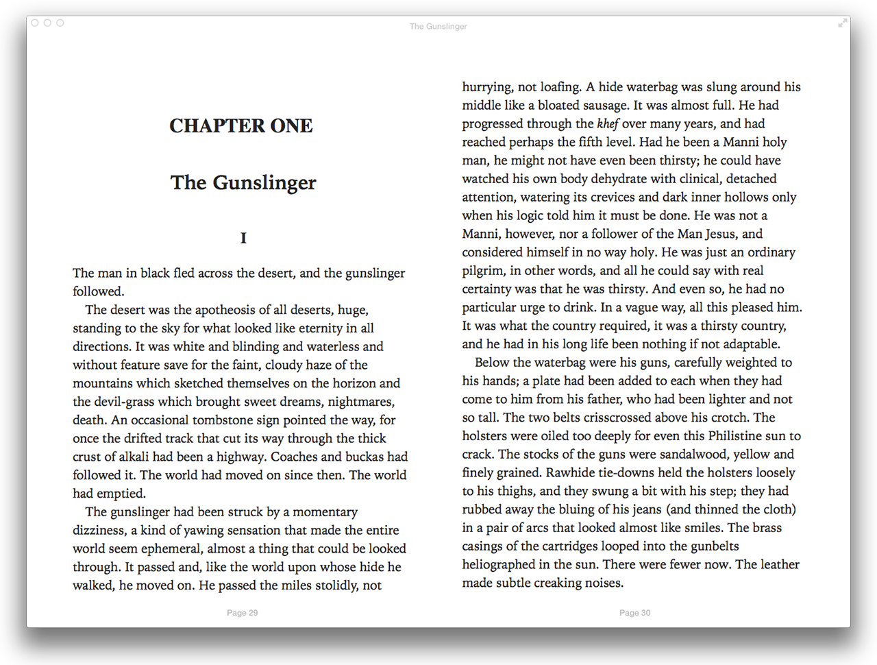
iBooks: no stacks of paper, no cloth bookmarks, no leather covers. Just the words, thank you.

That wasn’t so hard, was it? We don’t need drawings of leather covers or lighting effects reproducing the shadows that fall on paper pages as they curve downward into a spine. We just need the text, nicely displayed, and that’s what iBooks provides.

The reading window has a small toolbar that fades in when the cursor hovers over the top of the window, providing access to the table of contents, highlights and notes, appearance options, search, and bookmarks.

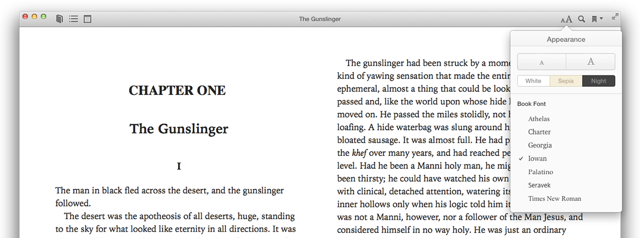
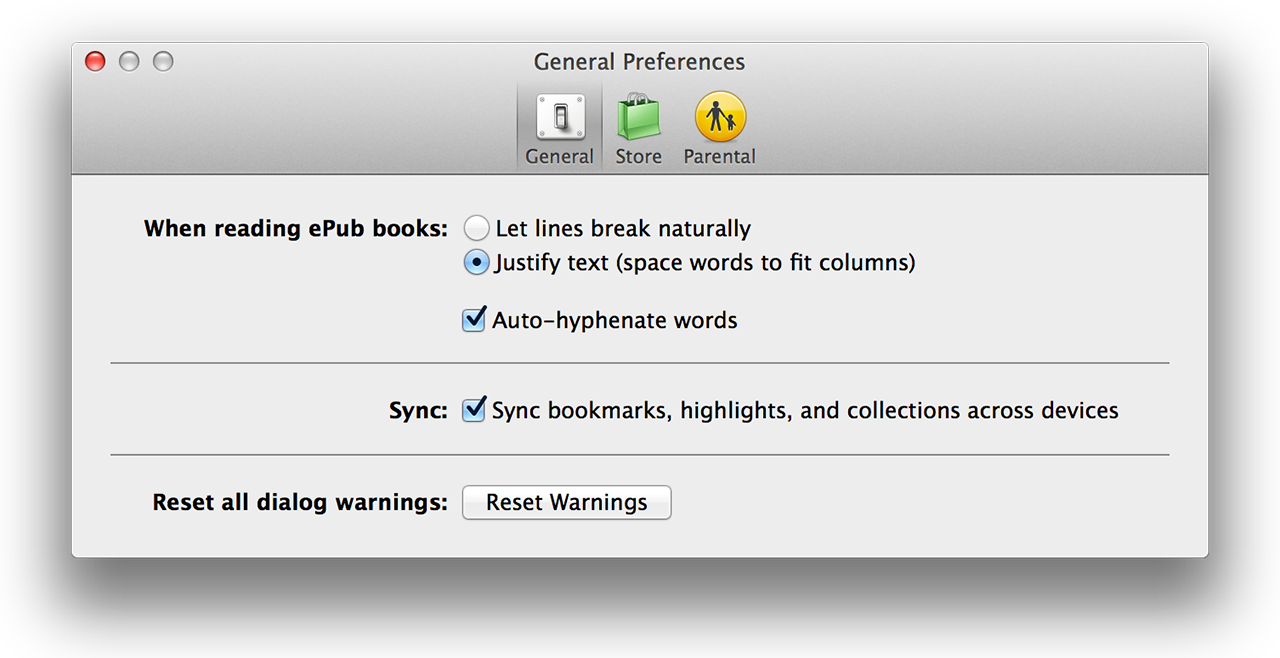
There are limited but reasonable appearance options: three color themes, seven fonts in a dozen sizes, single- and double-page display modes, and full-screen support. Blessedly, there’s also an option to turn off full justification and a separate option to disable automatic hyphenation.

Even the iBooks toolbar is understated (albeit non-standard). The appearance options are simple but adequate.
Text layout options to satisfy most tastes. The defaults are shown.

Unlike in Kindle Reader for the Mac, the iBookstore is accessible directly from within the application. Unsurprisingly, it looks a lot like every other Apple media store; this isn’t a bad thing.

The iBookstore should look familiar to anyone who frequents Apple’s other digital marketplaces.

iBooks can read DRM-free EPUB books in addition to books purchased from the iBookstore. It can also import and organize PDFs, but reading one launches OS X’s Preview application.

This is definitely a version 1.0 product. The pre-release versions suffered from the expected crop of cosmetic and functional bugs. The network-resident store-that’s-not-really-a-webpage is a bit clunky, often feeling strangely slower on the Mac than it does in iOS. And as with the Mac App Store, there’s no equivalent of browser tabs or multiple windows to make browsing the store a bit more flexible.

Apple got the important part right: iBooks provides a pleasant, uncluttered way to read iBookstore purchases on a Mac. It’s about time.

Maps

Part of the reason that Apple abandoned Google Maps in iOS 6 was that it was falling behind the Web and Android incarnations of Google Maps. The divorce was messy to say the least. Apple has been scrambling to overcome a terrible launch and restore faith in its new mapping service.

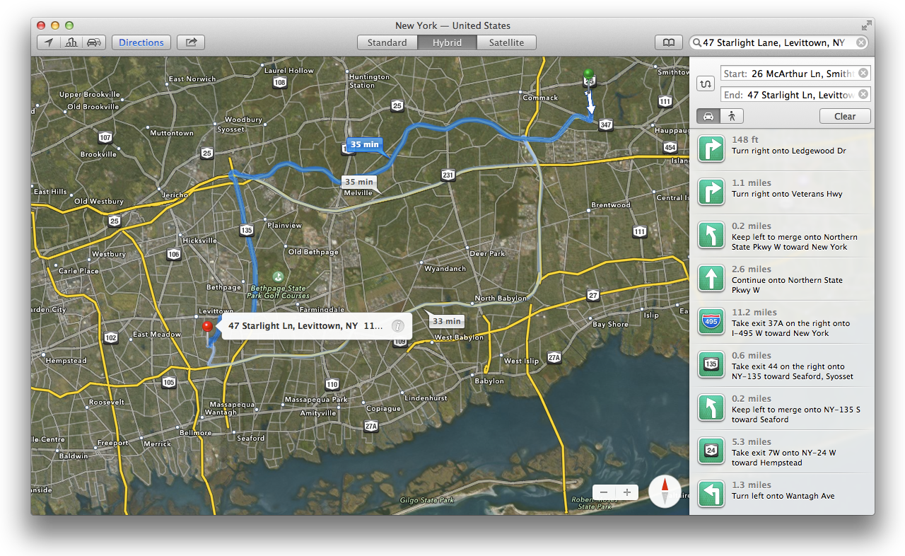
Should Mac users have felt slighted that only iOS devices had access to Apple maps during this past year? Perhaps not, but it doesn’t matter now because Mavericks lets Mac users join the ranks of Apple maps users. The predictably named Maps application should be familiar to anyone who has used Apple maps in iOS 6, right down to the graphics and icons.

Sharing directions or map locations ranges from seamless to awkward. Send directions to someone on a device running iOS 6 or later and the recipient will be sent right into the iOS maps application. Map locations are e-mailed as a map image and a vCard attachment with the address. E-mail directions and the lucky recipient will get a PDF(!) showing the route and turn-by-turn directions.

These are all a far cry from the simplicity of a link to maps.google.com. Wouldn’t it be nice if there was a maps.apple.com website providing maps access to anyone with a Web browser? In fact, there is such a site, and sharing a location or directions from the OS X Maps application will include a link to it that looks something like this:

http://maps.apple.com/?q=40.911852,-73.254653&sspn=0.010284,0.023626&sll=40.911844,-73.254653

But don’t expect to see a Google-Maps-like Web interface at maps.apple.com; it merely redirects to the “best” available location: the Apple Maps app in iOS, the Maps application in Mavericks, and (embarrassingly) the Google Maps website if you’re running a non-Apple OS or an older version of OS X.

It’s a testament to Google’s Web expertise that using Apple’s native Maps application doesn’t feel appreciably more powerful or responsive than using Google Maps in a modern Web browser. And Google Maps has features like Street View for which Apple still has no answer.

I’m glad OS X has reached feature parity with iOS in yet another area. The OS X Maps application is perfectly adequate, even if it doesn’t dazzle; we’ve seen these features before in iOS 6, after all. But Apple really needs to step up its mapping game if it ever wants to catch up to Google.

Multiple displays

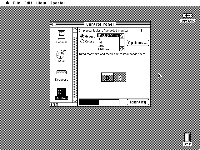
Twenty-five years ago (yikes), the Macintosh was known for its excellent built-in support for multiple monitors. The Monitors control panel showed the relative sizes of the attached displays as well as their positions, which could be adjusted by dragging. During normal use, the mouse cursor would move smoothly from one display to another, crossing over at the edges where the monitors met.

The System 6 Monitors control panel: built-in support for multiple displays in 1988.

The primary display was selected by dragging the representation of the menu bar from one tiny screen to another. The system could even handle monitors with different color depths. Dragging a window so it was half on a 256-color display and half on a black-and-white display was a big nerd crowd-pleaser in the late 1980s, let me tell you.

Fast-forward a few decades and the capabilities (and user interface) that the Macintosh pioneered are now taken for granted. But when it was the Mac’s turn to play catch-up two years ago with OS-level support for full-screen windows, the handling of multiple displays came to the fore once again.

In Lion, triggering full-screen mode for a window caused all other attached displays to be filled with the now-blessedly-banished linen texture. This behavior was especially infuriating when using a projector as a secondary display. Click the full-screen widget on the window being projected and the entire room gets treated to a giant swath of gray linen. Smooth.

Mountain Lion offered a little relief, allowing windows to go full-screen on any display—but still covering all the other screens with linen.

Mavericks finally sets things straight. Each attached display is now treated as a separate domain for full-screen windows. Mission Control gestures and keyboard shortcuts will now switch between the desktop and full-screen windows on the display that contains the cursor only, leaving all other displays untouched.

The price of this feature is the loss of the aforementioned nerd-impressing ability to have windows that span multiple displays. In Mavericks, a window can span screens while being dragged, but it will appear partially transparent on the destination screen until the cursor touches the edge of the screen from which the window is being dragged, at which point the opaqueness will switch sides. Releasing the window mid-drag leaves it visible only on the screen where it’s opaque.

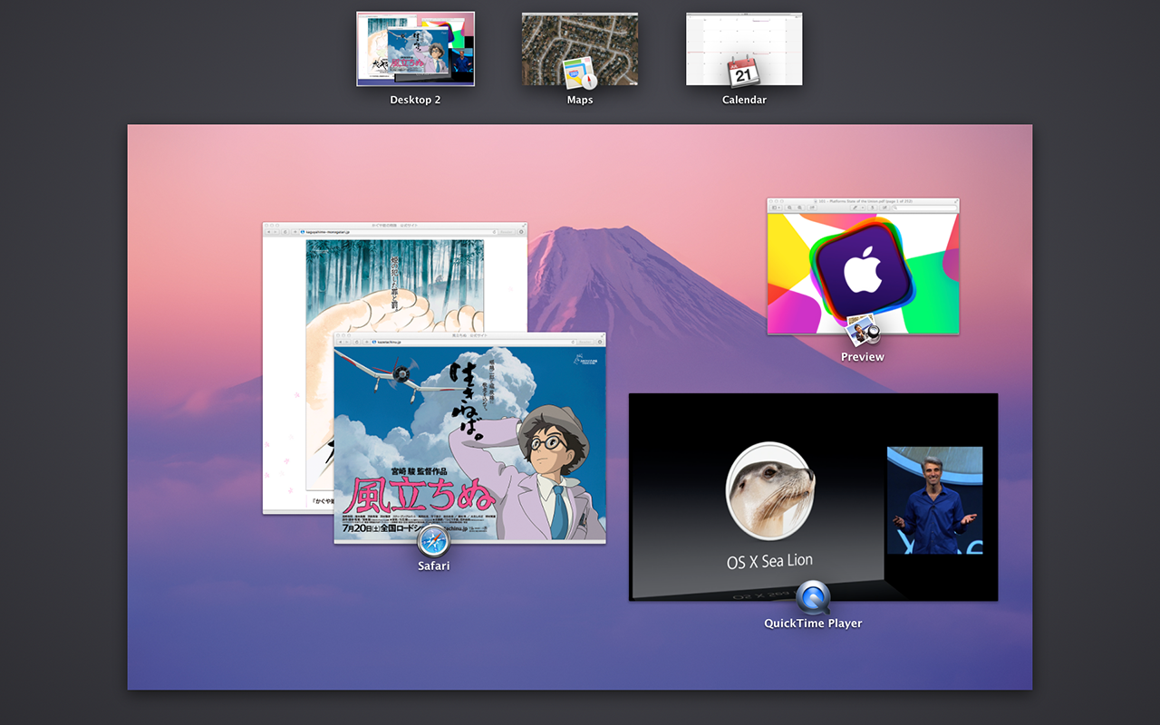
Mission Control now displays on all attached screens when activated, each screen showing its own desktop and application windows. Windows (full-screen or otherwise) can be dragged between the separate Mission Control domains.

A second Mission Control domain on a second monitor; note the “Desktop 2” item at the top.

These changes alone make Mavericks a must-have upgrade for some people—but wait, there’s more. For as long as Macs have supported multiple monitors, people have asked for a way to quickly access the menu bar from a non-primary display. Several third-party applications have provided this ability over the years. Mavericks finally makes it official—and mandatory. The menu bar now appears on every attached display.

This feature finally provides a legitimate function for the ill-considered translucent menu bar added to OS X five years ago: put an opaque menu bar on the screen with the current input focus and use a translucent menu bar on all the other displays.

Unfortunately, Apple is still convinced that there’s some value in allowing the desktop background to impair the readability of the menu bar on the display with the currently active application. In Mavericks, other displays get an even more (and differently) translucent menu bar.

The translucent menu bar on the primary display.
The other, differently translucent menu bar on a secondary display.

The option to disable the translucent menu remains (in the Desktop & Screen Saver preference pane). Using it creates the experience I want: opaque on the display I’m using, translucent elsewhere.

Interestingly, since each full-screen window is tied to a display and has its own menu bar (visible when the cursor hits the top of the screen), it’s now possible to have two different menu bars visible at once in OS X. Just use a non-full-screen window from one application on one display, then press the mouse cursor against the top edge of another display containing a full-screen window from a different application. Truly, we are living in the future.

The Dock is also available on each display. When the Dock is positioned on the bottom of the screen, dragging the cursor to the bottom of a secondary display will cause the Dock to appear there (and disappear from the primary display). This feature is a little finicky in practice, often requiring an extra bit of downward mouse-dragging or trackpad swiping to trigger it.

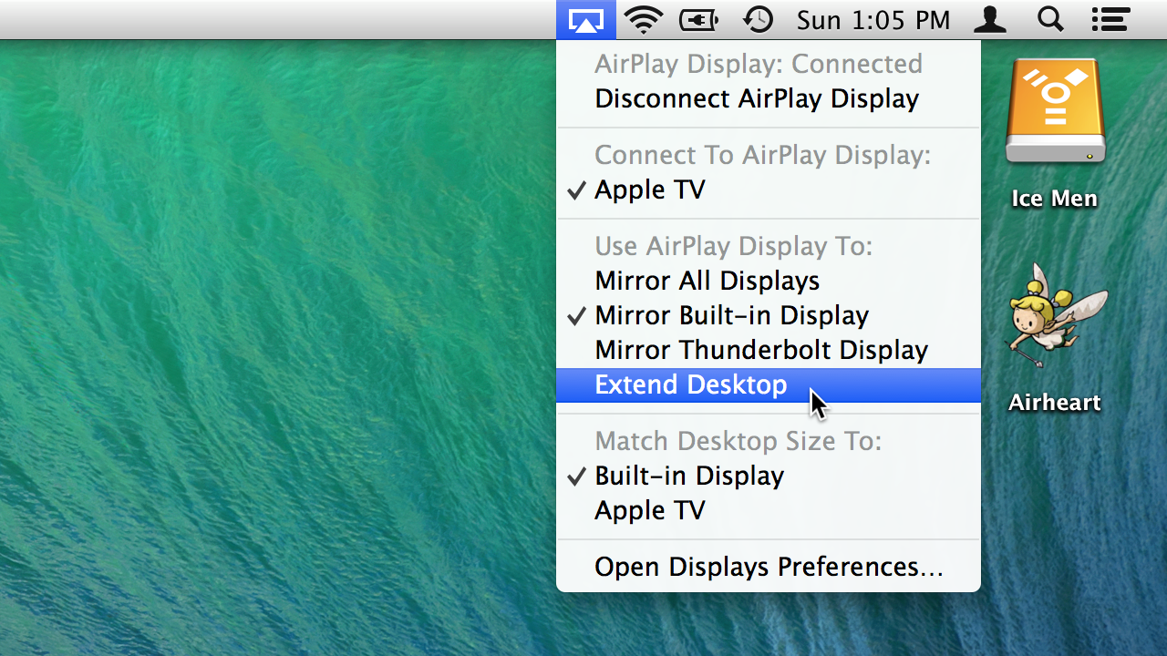
AirPlay-compatible displays (e.g., your television set with a 2nd or 3rd generation Apple TV attached) can now be used as full-fledged additional displays, instead of just mirroring the primary display. (AirPlay displays can also mirror any other attached display.) Like the existing AirPlay mirroring feature, this functionality is limited to Macs from early- to mid-2011 or later.

New AirPlay display options: extend, instead of just mirror.

Apple has made improved support for multiple displays one of the headline features of the Mavericks marketing campaign. For people who never use more than one monitor, that may seem silly. But the cumulative annoyance of the pre-Mavericks behavior for those of us who use multiple monitors on a regular basis should not be underestimated. Mavericks makes multiple monitors work the way we’ve all wanted them to for years.

Well, perhaps not all of us. If you prefer the old behavior, uncheck the “Displays have separate Spaces” checkbox in the Mission Control preference pane. Doing so will also restore the ability to have windows that span more than one display. You know, for old times' sake.

Energy saving

Nine years ago, Apple sold more laptops than desktops for the first time. These days, Apple routinely sells three to four times more laptops than desktops. It seems strange, then, that Apple waited so long to release a version of OS X heavily focused on extending battery life.

Back in the early 2000s, Apple’s laptops compared favorably to contemporary Windows laptops in terms of battery life. Today, the bar has been raised—not by Windows laptops, but by iOS devices, which now outsell Macs 10-to-1. The battery life of the iPad in particular has embarrassed Apple’s heavier, more expensive Mac laptops from the day it was introduced three years ago.

Apple has done a lot to reshape its Mac laptop hardware in the image of iOS devices. Moving parts were eliminated (optical discs, spinning hard drives); removable, self-contained parts were replaced with smaller, custom-fit equivalents (SSDs, batteries); and the number of chips on the logic board has steadily decreased (discrete GPU and north/south bridge chips replaced with integrated GPU and on-package PCH). All of this has led to increased battery life, with Apple’s latest Haswell-based MacBook Airs finally achieving run times comparable to the much smaller, lighter iPad.

Time to declare victory, right? Well, not quite. Yes, Apple’s latest laptops can reach 10+ hours of battery life… under the right circumstances. To understand the problem, consider the top energy consumers in a laptop: LCD, RAM, SSD, CPU, GPU. (We sure love our TLAs.) All of these components require some minimum amount of power to run. The display can be switched completely off, but at that point it’s not doing the user much good. The RAM must be refreshed every few dozen milliseconds, lest it lose all the data it contains. (Try not to think about it.)

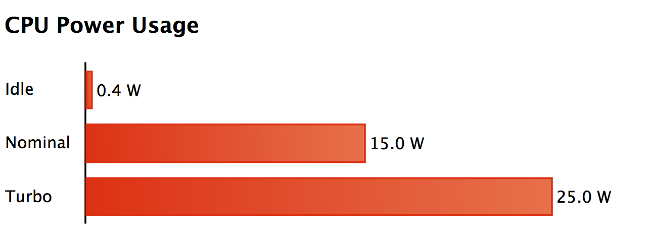
The trouble isn’t the minimum power required to keep things running, it’s the difference between the minimum and the potential maximum power consumed by the most demanding components of the system. When it comes to dynamic power range, nothing in a laptop beats the CPU/GPU combination (now both on the same die in Haswell). The chart below, used by Apple at WWDC to explain its energy-saving strategy in Mavericks, shows some power usage numbers for a typical modern laptop CPU with an integrated GPU.

(The “Turbo” label refers to Intel’s Turbo Boost feature that allows the CPU to run faster than its rated clock speed as long as power and thermal limits allow it.)

That’s a 60x range between idle and turbo. And make no mistake, a sustained power draw of 15 to 25 watts from the CPU alone will do terrible things to a new MacBook Air’s 54-watt-hour battery. (Do the math.) So much for a “12-hour” battery life.

No other component of the system has such a huge range between idle and maximum power combined with such a high maximum power level. A dimmed screen does not consume 60 times less power than a bright one; laptop RAM (soldered to the logic board in Apple’s modern MacBooks, Air and Pro) and SSDs will never use 25 watts even when running full-tilt.

Given all of this, the most effective software strategy for saving energy becomes clear: keep the CPU idle as much as possible.

This is not as ridiculous as it sounds. Even when you’re actively using your Mac, the CPU is probably spending most of its time waiting for input. Let’s say you’re an amazing typist and you’re clacking away on the keyboard at 120 words per minute. That’s about one keystroke every tenth of a second. In the time between each of your keystrokes, even the slowest 2013 MacBook Air has enough time to perform hundreds of millions of operations.

Of course, your typing is not the only thing happening on the system, nor is it the most stressful to the CPU. Perhaps a video is playing in another window; if you’re a developer, Xcode may be compiling your code as you type in order to catch errors; maybe some e-mail just arrived and was processed by the Mail application; Spotlight will get a chance to index each newly created or modified file; Time Machine may be running in the background.

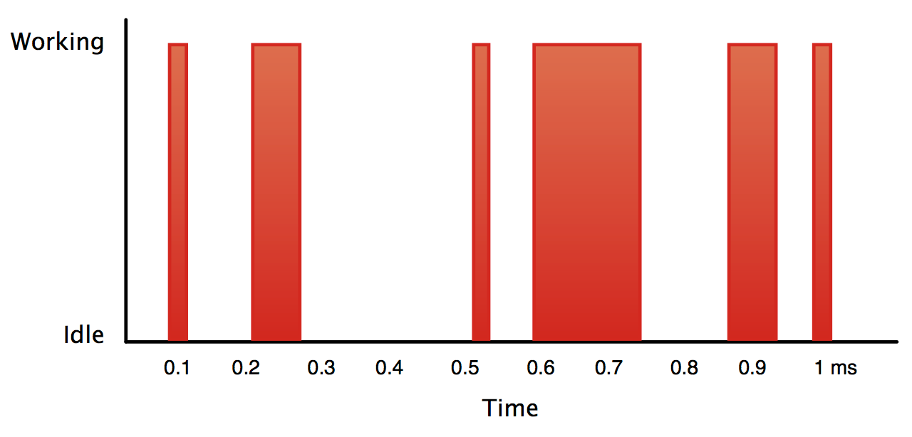
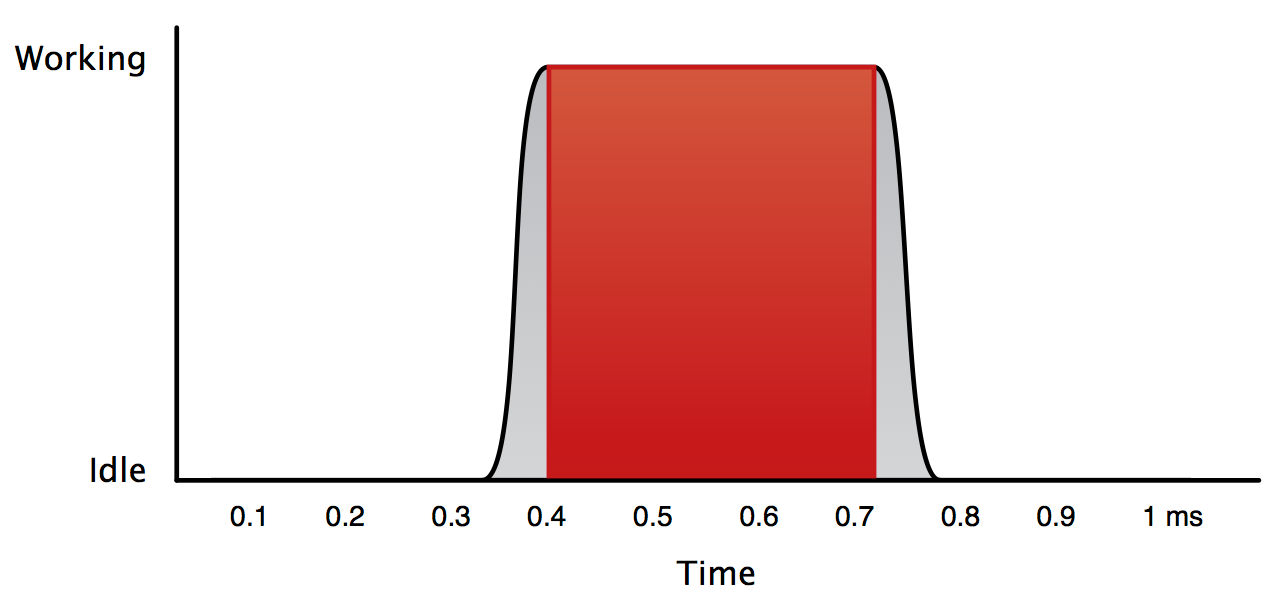
Here’s a simplified representation of a hypothetical CPU workload.

That sure looks like a lot of idle time, right? But there’s another wrinkle. Real CPUs don’t go from working to idle instantly. There’s some transition time to account for. It doesn’t take long, and the delay is getting smaller all the time, but it remains non-zero.

In practice, a modern Intel CPU can reactivate a clock-gated region of the chip in 10-15 microseconds, and it may take hundreds of microseconds to restore the state of a core that has been powered down entirely.

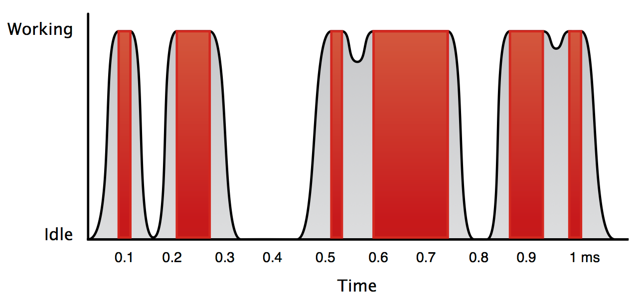
Look again at the scale on the x-axis of the chart above. It shows just 1 millisecond of elapsed time. Even a ten-microsecond transition is going to show up on that graph. Let’s add power state transition information to the chart (again, in a heavily simplified form).

Suddenly, the amount of truly idle time has decreased dramatically. When the gap between units of work is small enough, the CPU doesn’t get back to idle at all. All of that gray area under the curves is waste, and there’s a lot of it.

Now think back to the earlier examples of activities that might be using the CPU: processing keystrokes, playing video, compiling code, receiving e-mail, running backups, indexing files. Only some of this work has a hard deadline.

Things like audio and video playback may only need a small amount of CPU time, but they need it on a regular basis to prevent skipping or stuttering. Likewise, fast typists want to see their keystrokes reflected on the screen as soon as possible. As for everything else, there’s definitely some wiggle room.

And remember, we’re only considering a single millisecond of total time. With even just a little bit of tolerance for rescheduling, we can rearrange the work into a more efficient form.

Ah, that’s more like it! By coalescing the work into a contiguous burst of high activity, transitional waste has been cut to a bare minimum, and the amount of idle time has been maximized. Even better, this strategy becomes more effective as CPU speed increases. All other things being equal, if the CPU can complete the same amount of work in less time, it can get back to its power-sipping idle state sooner. (Picture the red block in the chart above becoming narrower.) This is called the “race to sleep” phenomenon.

There’s one final strategy to maximize CPU idle time. It’s the obvious one: do less total work. Background tasks like backups or Spotlight indexing can be slowed down, but like the laundry, they do eventually need to be done. Processing user input is unavoidable. But there’s a third kind of work that is pure waste.

Consider a progress bar in the Mail application, updated as it receives e-mail in the background. If Mail is not the front-most application right now, that progress bar probably doesn’t need to update ten times per second. Maybe updating once a second is enough. Or think of an animation running in a Web browser window that’s entirely obscured. That animation may not need to run at all.

A rule of thumb emerges: if it doesn’t benefit the user, either immediately or in the future, do it less frequently; if possible, don’t do it at all.

Energy-saving strategy summary

Let’s recap. The CPU is one of the most power-hungry components in a Mac laptop, but it also has the largest range between its idle and maximum power usage. Maximizing CPU idle time is therefore an effective way to extend battery life.

Because components of the CPU take some time to transition to and from an idle state, doing work in contiguous chunks minimizes the number of these transitions and increases the total time that the CPU is idle.

Eliminating work that produces no immediate or lasting benefit to the user can reduce the total amount of work to be done.

Now, finally, let’s see how Mavericks implements this strategy.

App Nap

App Nap is Apple’s umbrella term for a suite of energy-saving policies applied to applications in Mavericks. Like so many of the new technologies added to OS X over the years, App Nap includes new APIs for developers to incorporate into their applications. Apple is leading the way by using these APIs extensively in the applications and services that are part of Mavericks.

Unlike new technologies like sandboxing or Grand Central Dispatch, Apple is not content to wait for third-party developers to update their applications to use these new APIs. Applications running on Mavericks are eligible for App Nap by default.

The new Energy tab in the Activity Monitor application provides an overview of processes' power usage over time, including a new App Nap column.

When an application is napping, its CPU and I/O priority is lowered, causing the application to do less total work. But what about moving the work that is done into contiguous chunks, as described in the previous section?

Moving boxes on charts is easy; the past, present, and future are all laid out before you. Scheduling the actual work performed by real, running applications is quite a bit harder. Though the operating system can track the work done by each application, it can’t move new work backward in time to form contiguous chunks in the past. The best it can do is delay new work in the hopes of combining it to form contiguous chunks in the future.

Predicting future CPU usage is a tall order, but there’s one kind of work that makes the job easy: timers. Anything displayed on the screen that changes in response to the passage of time (rather than just user input) likely has one or more timers behind it. This includes obvious things like the clock in the menu bar, the blinking text insertion point, or a throbbing default button in a dialog, but also less visible things like applications that periodically pull information from the network (e.g., a stock ticker, news reader, or Twitter client). And don’t forget every use of the now-ubiquitous Core Animation framework.

Timers throughout Mavericks are coalesced in order to realize the energy savings described earlier. Even a single application is likely to have many timers running simultaneously. When all timers across the entire system are considered, there’s ample opportunity to align events and maximize uninterrupted runs of idle time.

Consider the three timers below, shown running at their natural intervals.

Given a little leeway to reschedule events, those timers might be coalesced as shown below.

When coalescing timers, Mavericks may delay events by around 100 milliseconds in order to get them to align with other events. (Unlike the example images above, timers will never be fired early in Mavericks; they may only be delayed.) This delay should be imperceptible to the user. In fact, in past releases of OS X, timers routinely experienced similar delays due to preemption from higher-priority processes or I/O tasks, or even just some other work happening on the same event loop. In Mavericks, the difference is that this delay is premeditated and purposeful instead of merely incidental.

Not all timers are created equal when it comes to conserving energy. High-frequency timers are the biggest energy hogs, often firing many times a second, repeatedly waking the CPU from its idle state. When App Nap is activated for an application, the maximum rate that any timer is allowed to fire is severely limited, requiring many seconds between events.

App Nap Policy

Right about now, you may be worried that Mavericks is going to make your Mac feel slower by starving all your applications of resources. But remember that the goal of App Nap—and Mavericks as a whole—is to extend battery life, yes, but also to improve responsiveness.

Rather than picturing App Nap as an energy miser, throttling all your processes to conserve energy, think of it as a guardian, ensuring that whatever you’re currently doing has access to as many system resources as possible. Success or failure comes down to the question of which applications should nap and when.

The policy in Mavericks is conservative. First, only normal Cocoa applications are eligible for App Nap. As mentioned earlier, this is true regardless of whether an application has been updated for Mavericks. The Cocoa framework itself makes several private system calls to tell the operating system that the process associated with an application is eligible for App Nap.

A new checkbox in the Finder’s Get Info window allows the user to disable App Nap entirely on a per-application basis—but only for applications that are not linked against the OS X 10.9 SDK. Developers who use the Mavericks SDK are expected to exert more fine-grained control over how App Nap affects their applications by using the new App Nap API.

Though Cocoa applications are signed up for App Nap by default and must opt out if they don’t want it, the existence of the aforementioned private system calls means that any other kind of executable that is not a normal GUI Cocoa application is not eligible for App Nap.

In fact, Cocoa applications that are not “foreground” applications (i.e., that do not have an icon in the Dock—see the LSBackgroundOnly or LSUIElement Info.plist keys for examples) are also not eligible for App Nap. (There are other energy-saving strategies for background applications; more on those later.)

For all applications that are eligible for App Nap, Mavericks applies a set of heuristics to determine when it’s safe and appropriate to put an application down for a nap. Several factors influence this decision: application window visibility and drawing activity, audio playback, user input event processing, and the use of the existing power assertion APIs.

One of Apple’s demos in the App Nap session at WWDC featured a Cocoa implementation of the classic xeyes application. A pair of simply rendered eyeballs whose gaze follows the cursor hardly seems like an energy hog, but it’s exactly these kinds of innocuous applications that can end up using far more than their fair share of system resources. Xeyes must track the mouse cursor constantly, even when it’s not the front-most application, and it must continually redraw its interface in response to these mouse movements.

Sure enough, the new Energy Impact column in Activity Monitor—a composite, unit-less estimate of an application’s energy usage over time—shows that a pair of mouse-tracking eyeballs can be surprisingly taxing. But with the default App Nap heuristics, dragging another window on top of the eyeballs, obscuring them completely, eventually causes the application to nap and its Energy Impact to drop to zero.

The exact weighting of the factors that influence App Nap will no doubt change as Mavericks matures. A completely hidden application is an easy call, but in the general case, it won’t always be so simple for the OS to understand which activities are important to the user. When Mavericks is forced to guess, it tends to err on the side of leaving the application unmolested. But Apple would like it if the operating system didn’t have to guess, which is why it provides several new APIs that allow developers to tune their applications for energy efficiency.

But before considering those, it’s worth noting that there’s a lot that developers can and should do to make their applications better citizens even when they’re not napping.

Energy best practices

One way to implement the xeyes demo application described earlier would be to periodically poll for the position of the mouse and then update the eyeball graphics to reflect the new cursor position. For smooth animation, this polling would have to be done at least 20 to 30 times a second.

Unfortunately, polling is one of the least efficient ways to accomplish this task. Even when the cursor isn’t moving at all, the application is checking and rechecking the mouse position many times a second—and possibly redrawing the eyeballs each time if the developer isn’t storing the previous state for comparison purposes.

OS X offers a much more energy-efficient global event monitoring facility. (This is not new in Mavericks.) The operating system is already tracking the cursor; there’s no need for individual applications to do so as well. The application merely needs to register its interest in the cursor position and the OS will notify it when the position changes. No polling needed. This means that the xeyes application’s CPU usage can drop to nearly zero when the cursor isn’t moving, even when its window is not obscured and the application is not napping.

This is the ideal: when an application isn’t doing anything useful, its CPU usage should be as close to zero as possible. To achieve this, Apple discourages all forms of polling. Nearly every interesting event on the system can be delivered on demand to interested applications: FSEvents for file system changes; GCD's dispatch sources for file and network I/O, process creation and destruction, and signals; semaphores and locks for process synchronization.

Once an application has excised all forms of polling, it’s time to consider what else can be done in Mavericks to become even more efficient.

App Nap API

As we’ve seen, the App Nap heuristics can do a reasonable job of detecting applications that aren’t providing useful feedback to the user and then applying the App Nap energy-limiting policies to them. But this process is not perfect, and, more importantly, an unmodified application will be unaware that it’s happening.

Rather than waiting for App Nap to be applied by the system (which in practice can take around ten seconds), applications can use the new App Nap APIs to take matters into their own hands.

Visibility

The first set of APIs allows applications to detect when they’re occluded and then take action themselves. An application is considered occluded if it has no visible windows. (The menu bar, technically a window, doesn’t count unless it contains a status bar icon created by the application.) If even a sliver of a window is showing, the application is considered visible. Windows that are minified to the Dock are not considered visible.

Application occlusion state is represented by a bit field (hey, they’re not just for the 1980s!), with only one bit used right now to represent two states: completely visible and completely hidden. It seems like Apple has plans to make this API more granular in the future.

There’s also an occlusion API for individual windows. The same rules apply: if any part of a window is showing, it’s considered visible. And as with the application occlusion API, window visibility is currently represented by a bit field with only one bit used.

An application can use these visibility APIs to immediately discontinue expensive operations that can no longer benefit the user when some or all of its windows are hidden. Crucially, the application can also immediately resume those activities the instant visibility is restored.

The energy savings provided by completely discontinuing work when possible are even more dramatic than merely doing work more slowly due to the limitations automatically imposed by App Nap. This brings applications ever closer to the ideal of doing zero work and using no system resources when idle or ignored.

Timer tolerance

We’ve already seen how Mavericks will attempt to coalesce timer events to reduce the number of transitions to and from the CPU’s idle state, how App Nap can limit the maximum rate at which timers are allowed to fire when an application is napping, and how periodic polling using a timer is an inefficient way to detect changes elsewhere in the system.

But there are instances where strictly time-based operations are part of an application’s core functionality (e.g., a reminder application, an RSS reader, or a Twitter client). In cases where the use of timers may be appropriate, Mavericks provides a way to express a time-shifting tolerance for each explicitly created timer beyond the standard 100-millisecond tolerance applied to all timers by default.

If an application has a timer that fires every 10 seconds, perhaps a tolerance of one second or more is appropriate. The more timers on the system with large tolerance values, the more flexibility Mavericks has when coalescing timer events. Developers are strongly encouraged to apply larger tolerance values—10 percent of the timer interval is suggested—in cases where millisecond precision is unnecessary.

Timers can also be explicitly exempted from App Nap’s rate limiting. Apple cautions that such timers should be rare, perhaps used only when an application interacts with a hardware device or network with specific latency demands. These “strict” timers still accept a tolerance value in milliseconds, though, and a value of zero is strongly discouraged.

User activities

The new user activities API provides a way for applications to improve the system’s App Nap heuristics. With it, applications can tell the system the nature of the work they’re performing, including a descriptive string that may show up in system logs and other diagnostic messages (e.g., in the output of the pmset -g assertions command).

The most common type of activity is “user-initiated,” meaning any task performed as a result of direct user action (e.g., clicking a button, selecting a menu item). A variant of this activity type explicitly requests that the Mac not be allowed to go to sleep for the duration of the activity.

There’s also a “background” activity type that’s meant to be used for maintenance tasks and other operations that are not time-sensitive. Background tasks have a lower CPU and I/O priority to prevent them from contending with user-initiated tasks in the same application.

Activity type options can be mixed with any activity type to modify its meaning: a “latency-sensitive” option for tasks that can’t afford to be unduly delayed; options to disable display or system sleep; and options to disable Sudden Termination or Automatic Termination.

Many of these options are just nicer front-ends to the existing power assertions API, but the user activities wrapper makes them much more convenient to use from a Cocoa application while also making it less likely that a developer will forget to release a power assertion.

A single application can have multiple types of activities running at once, and App Nap will take all of them into consideration when deciding when it’s time for an application to take a nap.

Energy shaming

Mavericks has one final energy-saving trick up its sleeve. Except in extreme cases, applications that burn CPU cycles needlessly usually do so without drawing attention to themselves. When battery life suffers, everyone’s ready to blame Flash animations running in browser windows or graphics-intensive games, but the real culprit may be the constant low-level waste generated by dozens of seemingly innocent applications: Twitter clients, text editors, status items in the menu bar, even preference panes.

To help developers determine if their application is wasting energy, the new version of Xcode includes an extensive set of tools for measuring and displaying energy usage over time.

Xcode 5’s energy impact tools.

But perhaps most importantly, the battery status menu in Mavericks now includes a “hall of shame” section that lists applications that are currently using “significant energy” on the system.

The battery status menu now calls out energy-hogging applications.

I can imagine Mac developers everywhere cringing at the thought of the e-mail they’re going to receive from users when their application shows up as an energy hog. Some applications need “significant energy” to do the task they’re designed to do.

Presumably, Apple will try to avoid reporting such activities as wasteful, but that may be unavoidable. And it’s pretty easy to get some of Apple’s own applications to appear in the menu, as shown in the screenshot above. Selecting an application from the menu launches Activity Monitor, switches to the Energy tab, and highlights the guilty application.

Despite the customer support noise that this feature will inevitably create, it may very well be one of the most important energy-saving features in Mavericks. Apple has been preaching the doctrine of efficient resource usage on OS X for years now. But silent, parasitic energy loss due to a statistical haze of slightly inefficient idle applications is not a good motivator for developer action.

With Mavericks, Apple has forced the issue. Applications will be subject to App Nap if developers do nothing; energy hogs will be reported in a place that’s easily discoverable by the average Mac user. This combination of factors should finally result in some real action for actively developed Mac applications. (The best developers have already improved their applications' energy efficiency for Mavericks.) It might even cause people to finally abandon applications that haven’t been updated in years, once their battery-sucking ways are revealed.

Background tasks

For many years now, daemon processes in OS X have been managed by launchd, Apple’s all-singing, all-dancing background task manager. A surprising number of OS services are implemented as daemon processes that applications communicate with via IPC (usually indirectly, through a framework).

In Mavericks, these services run with a reduced priority, allowing GUI applications to take precedence when there’s contention for CPU cycles or I/O. But when a GUI application makes a request to one of these services, the service process’s priority is “boosted” for the duration of the request, allowing it to quickly service the request and then go back to its reduced-priority state.

Background jobs created by the user or by third-party applications can also adopt this priority-boosting behavior by setting a new ProcessType property in the description of the job. Apple categorizes the possible ProcessType values by how much they’re allowed to contend with “normal” foreground GUI applications. Here’s the list.

Process Type Contention Behavior
Adaptive Contend with normal applications only when doing work on their behalf
Background Never contend with normal applications
Interactive Always contend with normal applications
Standard Default behavior in Mountain Lion and earlier

Adaptive jobs also have the ability to maintain their priority boost even after the reply has been sent to the requesting application (e.g., if the work it’s doing on behalf of the application is asynchronous, it might send a reply even before starting the actual work).

Centralized task scheduling

In OS X, there are many tasks that need to be done “eventually” but are not particularly sensitive to delays. New volumes must have their Spotlight indexes created. Long-running services that create many temporary files as part of their work should take a break every once in a while and clean up their messes. Apple’s servers need to be contacted periodically to check for updated versions of applications and the OS itself.

The lack of urgency for these tasks doesn’t mean that any time is as good as any other. For example, the experience of using a fresh installation of OS X has been slightly dampened for years by the Spotlight indexing process that often kicks off immediately upon login. And if your MacBook is down to its last 15 minutes of battery life, that’s definitely not when you want it to grind away at your disk checking if you have the latest versions of all the applications you’ve purchased from the Mac App Store.

Mavericks breaks these kinds of tasks into two categories, once again defined by their contention behavior.

Activity Type Contention Behavior
Maintenance May be interrupted by any normal user activity
Utility May be interrupted by resource shortages (e.g., RAM, CPU cycles)

For example, the Software Update job in Mavericks is declared to be a “Maintenance” task, meaning it will try to run when you’re not actively using your Mac. Time Machine’s backup process, on the other hand, is marked as a “Utility” task, meaning it will run as long as there’s no undue contention for the resources it needs.

Individual tasks can further narrow the conditions under which they will run by specifying the following criteria:

Requirement Description
Allow Battery Allow the task to run when using battery power. The default value is false for “Maintenance” tasks but true for “Utility” tasks.
Require Screen Sleep Require the primary screen to be in sleep mode. The default value is false.
Battery Level Require a specified minimum battery level percentage. A default (presumably low) minimum battery level is chosen by the system to preserve the last shreds of battery power.
Require HDD Spinning The task should only be performed while the hard disk drive is spinning. In other words, don’t spin up the hard drive just to perform this task. (SSDs are always considered to be spinning.) The default value is false.

Applications can programmatically create these kinds of background tasks, specifying the activity type, the required conditions, and the interval between runs (with an optional grace period akin to the adjustable timer tolerance). These tasks are persistent across launches of the applications and reboots of the system. If a task is interrupted (e.g., due to user activity, the removal of AC power, a battery level drop, etc.) it will be resumed automatically by the system when possible.

If you’re curious about the background tasks that are part of OS X, look in the /System/Library/LaunchDaemons and /System/Library/LaunchAgents directories. There you will find a collection of launchd property list files. In Mavericks, look for the com.apple.xpc.activity key in the property list to see if the job is using any of the new task scheduling restrictions described above.

Compressed memory

Apple has historically had a bad reputation among tech-savvy Mac users for including too little RAM in its default hardware configurations. Constantly being on the ragged edge of available RAM can severely affect the experience of using a Mac. For years, I’ve practically begged everyone I know who’s getting a Mac to opt for more than the standard amount of RAM. Sure, people say they’ll just be using it for “light Web browsing and e-mail,” but even casual usage of Safari, Mail, iPhoto, and iMovie can translate into some serious RAM usage.

What is RAM for if not to be used? Ah, but as the aforementioned tech-savvy Mac users know all too well, when OS X runs out of RAM, it starts copying data from RAM to swap files on disk. If that same data is needed again soon, it has to be read back from disk. If RAM is still tight, some other data in memory has to be evicted from RAM and written to disk to make room for the incoming data. If this process keeps repeating itself, you have what’s known as “thrashing,” where the system is spending most of its time ferrying data between RAM and disk.

Data spilling over from RAM to disk may not seem like such a big deal if you don’t recall exactly how much longer it takes to get information from disk than from RAM. Reminder: it takes hundreds of thousands of times longer to read data from a spinning hard disk than from RAM. SSDs are much faster than spinning disks, but they’re still hundreds of times slower than RAM.

This performance cliff is why iOS was designed to work without a swap file. It’s also why iOS ruthlessly kills applications that are not currently being used. Though OS X’s automatic termination feature makes some moves in that direction, swap is here to stay on the Mac (for now). But avoiding it is still a big, big win.

This isn’t just a performance issue, however. Performance and energy consumption are inextricably linked. Recall the concept of “race to sleep.” The faster a task can be accomplished, the sooner the Mac can get back to its low-power idle state. SSDs may not have any heads to move or platters to spin up, but they’re still hundreds of times slower than RAM—and time is energy.

One way to avoid filling RAM is to run fewer applications. Automatic termination helps with that. Another solution is to reduce the amount of RAM in use by the applications that are running.

For years, OS X has included APIs that allow applications to designate regions of memory as “purgeable.” For example, an application might cache the results of some expensive operation in a purgeable memory region. If the OS needs more RAM, it’s free to take the memory used by that cache and use it for another purpose. If the application that created the cache needs that information again, it will just have to recompute it.

You might think that no application developer would ever willingly mark any memory as purgeable. Why volunteer to have your memory reclaimed by the OS? But the OS will not be denied; it is going to reclaim RAM no matter what. Purgeable memory regions allow developers to choose which memory gets reclaimed first from their applications.

If RAM is still scarce, the OS has its own caches and purgeable regions of memory to harvest. Memory-mapped files can go back to living only on the disk. In-memory caches of file system data and metadata can be expunged.

When every application has been squeezed and every OS cache has been purged and the demand for RAM still hasn’t been met, that’s when previous versions of OS X would have no choice but to start hitting the swap file.

In Mavericks, the OS has one more option before it has to resort to swapping: compressed memory. Mavericks will find the least-recently-used data in memory and compress it, usually to about half its original size. Et voilà, more free memory.

Like the HFS+ compression feature introduced in Snow Leopard, compressed memory trades relatively abundant CPU cycles for decreased disk I/O. The compression and decompression process is extremely fast, using the WKdm compression algorithm, and it will run in parallel, taking advantage of multiple CPU cores.

Intuitively, a multi-core CPU grinding away compressing data in RAM does not seem like a winning strategy to save energy. But our intuition is often wrong when it comes to real-world energy use on modern hardware. Remember, it’s a race to sleep! Avoiding shuttling data between RAM and that hundreds-of-times-slower-than-RAM SSD is a big win as long as the compression task can be completed in a fraction of the time it would take to access the SSD. It can be, and it is.

In fact, Mavericks seems fairly terrified of the swap file. Here’s what Activity Monitor’s memory summary looks like when the system is just about at the limit of its RAM capacity.

15.99GB out of 16GB of RAM in use, and yet Mavericks still keeps its cool, holding the line at 0 bytes of swap.

Ask for more RAM in this situation and Mavericks goes after its own file cache while still holding the line on swap. Ask for way more RAM—gigabytes more—and the memory compression starts. Eventually, the use of swap is unavoidable. But just look at how far Mavericks can go before it finally resorts to swapping to disk.

Mavericks with a heroic 8.54GB of compressed memory, finally dipping its toe into a few megabytes of swap.

Put Mountain Lion under the same kind of memory pressure and things go south quickly. As soon as RAM is exhausted, Mountain Lion has no choice but to start swapping to disk, driving performance off a cliff. Mavericks doesn’t even touch swap until it’s squeezed several gigabytes more data into RAM than the Mountain Lion system.

Memory compression is a triple play for Mavericks. It’s a performance win; compressing and decompressing data in RAM is much faster than reading from and writing to disk, even an SSD. It’s an energy win; the less time spent moving data between RAM and disk, the more time the system can spend in its idle state. And finally, it’s a capability win; Mavericks can handle much more demanding workloads than previous versions of OS X before crying uncle.

Battery benchmarks

Though applications will have to be updated to take full advantage of the energy-saving enhancements in Mavericks, Apple has had some time to practice what it preaches and has updated the applications and background tasks that come bundled with the OS. It stands to reason, then, that a clean installation of Mavericks running only bundled applications should exhibit better battery life than those same applications running on Mountain Lion.

To test this, I created a light Web browsing and text-editing automation script specifically designed to allow applications to remain idle for several seconds between each action. Briefly running the test on Mavericks and inspecting the running applications in Activity Monitor revealed that some applications do indeed enter App Nap between the spurts of automated activity.

I also installed Flash Player in both Mavericks and Mountain Lion, and I intentionally chose some websites that include Flash. These tests were run on the GM build of Mavericks and OS X 10.8.5 with all updates (as of October 4, 2013) applied.

The first test system was my venerable pre-unibody 2007 MacBook Pro, so the numbers obviously don’t reflect the modern experience of using a Mac laptop. The Core 2 Duo CPU and discrete GPU in this Mac also lack the amazing low-power idle capabilities of the latest Haswell-based MacBook Airs. Can Mavericks do anything at all for this old clunker? You bet it can.

Yes, kids, this is what battery life was like in the days of optical drives, removable batteries, and 65nm CPUs.

That’s a whopping 25 percent increase in battery life for Mavericks on this extremely old laptop. The increase on modern hardware like the new MacBook Air can be even more impressive.

As if the new MacBook Air’s battery life wasn’t obscene enough already.

The MacBook Air exhibited widely varying results for Mountain Lion in repeated executions of this test, ranging from a low of just over 9 hours to a high of nearly 14 hours. The Mavericks results were more consistent, but they still varied by up to an hour and a half in either direction.

All of this is to say that the MacBook Air’s impressive 30 percent increase in battery life shown above probably depends heavily on many factors outside your control. I suspect the aggressiveness of the auto-playing Flash ads that happen to be on specific websites on a particular day may partly explain the huge variability in Mountain Lion’s numbers. Some of the lower-scoring Mountain Lion trials may have also had the bad luck to coincide with energy-intensive periodic jobs—jobs that are prevented from running on Mavericks due to AC power or battery-level restrictions as part of centralized task scheduling.

But even on Mountain Lion’s best day, the increase in battery life for Mavericks on the new MacBook Air is nothing to sneeze at, typically providing an extra two hours of work time in our tests. The next time you’re about to run out of juice on your MacBook, think about how much you’d pay to put an extra hour or two back on the clock.

These tests may or may not be representative of how you use your Mac, but regardless, it’s clear that Apple’s efforts have not been in vain. Mavericks really does consume less energy than Mountain Lion when performing the same tasks.

Energy summary

Conserving energy is not sexy. In the technology world, sexy usually means more, better, faster. Within the hardware limits set by the battery capacity and the energy consumption of the system components, the only way to run longer is to do less work. Ascetic computing just doesn’t sound like fun. How many pre-WWDC OS X 10.9 wish list stories in the tech press even mentioned battery life at all?

And yet we all find big increases in battery life attractive, sometimes even revelatory, once we experience them. New MacBook Air owners have been giddily posting pictures of their battery status menu and explaining how it has changed their habits and, in some tiny way, their lives.

The iPad introduction had a similar effect. Very little of the hype before the original iPad was released was about long battery life, but these days it’s routinely recognized as one of the most important features of the product, even by iPad skeptics.

There’s sexy and then there’s the stuff that makes people fall in love with products for the long haul. By now, Tim Cook’s emphasis on what he calls “customer sat” is well documented. When viewed through the lens of customer satisfaction, the focus on battery life in Mavericks is the first step down what will undoubtedly be a long and fruitful road for OS X.

It will be a long road for everyone. Apple can only do so much by changing its own applications and the OS itself. The universal application of App Nap shows that Apple is more willing to be aggressive about energy consumption than it has been about other OS enhancements over the years, but third-party applications will have to be updated—or abandoned—to realize the full potential of these new policies and technologies.

Apple’s vision of the hypermiling OS X of the future is attractive. Even setting aside the advantages of longer battery life, the fervor with which Mavericks attempts to shun all work except that which I, the user, am directly requesting at this particular moment is heartening. A Mac that drops everything to service my immediate needs is a better Mac, even when it’s plugged into a power outlet.

Hardware changes will probably always yield more dramatic energy savings than any OS update, but software algorithms and policies are what lead to improved responsiveness. One day, I hope to look back on the experience of Spotlight, Time Machine, and Software Update swamping my system while I try to do useful work the same way I look back on being locked out of my Mac while a Finder copy operation was in progress: not particularly fondly and from a great distance.

Responsive scrolling

When Mac OS X 10.0 was released, it was dog-slow. To give just one example, starting with version 10.0 and continuing for release after release, there was a section of my reviews dedicated to the performance of window resizing in OS X. Outsiders might imagine that such mundane details would be beneath the attention of Apple and its customers. We know better.

Mac OS X’s user-interface responsiveness was just plain unacceptable back then. But there’s no endpoint when it comes to refinement, no mythical destination beyond which further improvement is pointless. In keeping with that spirit, Mavericks includes new APIs for improving the performance and responsiveness of scrolling.

Yes, scrolling. You may be thinking to yourself, what’s wrong with the way scrolling works in Mountain Lion? It’s true, OS X has always been pretty good at scrolling opaque content. And since the advent of Quartz Extreme over a decade ago, OS X can even slide sheets of transparent content past each other with aplomb. But there are still limitations inherent in the current approach to scrolling views in OS X.

Picture a long document as an imaginary vertical stripe that extends several feet above and below the screen. An application window frames only a small portion of the document.

Safari showing a portion of a longer webpage with the scrollable content visualized above and below.

Traditionally, the visible region is also the only region of the document that’s actually drawn by the application. After all, why waste time drawing content that’s not visible?

Scrolling the window causes new parts of the document to come into view. Each time that happens, the application must draw the content to fill the newly visible region. This cycle of moving the viewport and then asking the application to fill the area that’s been revealed means that scrolling performance is limited by the speed that the application can draw newly revealed content.

The new responsive scrolling API in Mavericks takes advantage of times when the user is idle to ask the application to draw small regions of the content that are not currently visible ("overdraw"), starting with the areas directly adjacent to the existing viewport and extending outward.

This continues until the system decides it has sufficient overdraw available to handle future scrolling events. This decision takes into account available memory and—you guessed it—the energy consumed by these speculative drawing excursions. The application itself can also tell the system that it would prefer not to produce any more overdraw (e.g., if doing so is computationally expensive or consumes a lot of memory) or if it would like to draw slightly more than the requested area (e.g., if the requested region intersects a subview that has to be instantiated in its entirety anyway).

The memory consumed by these overdraw regions is marked as purgeable, allowing the OS to reclaim that memory if RAM starts to fill up. This memory can be reclaimed without even waking the application if it happens to be in App Nap.

Responsive scrolling also alters the traditional arrangement for handling scrolling events. Rather than processing scrolling events on the main thread, responsive scrolling spawns a background thread for tracking user input (i.e., dragging on a trackpad or swiping a Magic Mouse). This background tracking thread will actually change the visible region of the view in response to scroll events. As long as there’s sufficient overdraw available, it can do this at a smooth 60 frames per second without disturbing the application’s main thread and without delaying the main event loop.

The main thread will be notified of the change and will synchronize its internal state. During an ongoing scrolling event, the synchronization process will also initiate more overdraw in the direction of the scrolling, sized partly based on the scrolling speed, anticipating the future needs of the background tracking thread.

It’s essentially a race between the available overdraw and the user’s scrolling speed. If the user scrolls fast enough to outpace the generation of more overdraw, the system reverts to the traditional pre-Mavericks scrolling behavior, with each newly revealed region being drawn on demand.

Applications that are built against the OS X 10.9 SDK don’t have to do anything special to enable responsive scrolling, though they may want to implement many of the new callback APIs to be notified when it’s happening.

A side-by-side comparison of scrolling in Mountain Lion and Mavericks reveals a perceptible improvement in smoothness. It feels a bit more like scrolling in iOS, where the content feels glued to your finger. The difference is subtle enough that some might question the wisdom of this change. I do not. Small changes add up over time, eventually bringing us to unexpected new places.

Furthermore, any change that adds another thread of execution has a bright future in our world of ever-multiplying CPU cores. This small step toward multithreading in OS X, like the many others that have come before it, is interesting in light of the history of OS X.

For a brief moment in 1996, it seemed like Apple might purchase Be Inc. and use BeOS as the basis of its new, modern OS. BeOS was ahead of its time in many ways, including its pervasive use of multithreading in the GUI. NeXTSTEP, with its single-threaded event processing and drawing, seemed positively antediluvian in comparison.

Requiring a separate thread for each part of the user interface makes for a responsive system that can easily take advantage of multiple CPU cores, but it can also cause problems by forcing programmers to deal with thorny synchronization issues and race conditions in even the simplest applications.

Here we are, sixteen years later, and the OS that NeXT built is growing into its own multi-core shoes nicely, without any radical upheavals along the way. Small changes add up.

iCloud Core Data

It’s been a rough year for iCloud—part of it, anyway. iCloud is an umbrella term encompassing many services and technologies. Three of them related to data storage were described in last year’s Mountain Lion review: Key Value Storage, iCloud Document Storage, and iCloud Core Data. (Core Data dates back to 2005, but its integration with iCloud is less than two years old.)

Here’s what I wrote about these iCloud data storage APIs last year:

The number of ways things can go terribly wrong for iCloud-enabled applications is astronomical. Apple has done a commendable job of creating the iCloud data storage APIs and the back-end service itself, but even if we assume these things have zero bugs, it’s still up to application developers to use these new APIs correctly.

That turned out to be an optimistic assessment. Though Key Value Storage and iCloud Document Storage have shaken out in the expected manner, iCloud Core Data has fared far worse. Over the past year, developer after developer has come forward to declare that there is no “correct” way to use Core Data with iCloud. It simply cannot be used to reliably perform its promised functions.

Rich Siegel of Bare Bones Software, creator of the venerable BBEdit text editor and a 25-year veteran Mac developer, provided the most thorough technical explanation of the issues involved. Abandonment of iCloud Core Data eventually took the shape of a full-fledged movement among Mac developers big and small, leaving in its wake frustrated customers, lost revenue, and a mad scramble to find viable alternative solutions.

Apple comes into Mavericks suitably chastened on this front. Its goal for iCloud Core Data: make it work for developers. This entails more than just fixing bugs. iCloud Core Data in Mavericks includes new functionality and new APIs.

The Fallback Store, a local Core Data database that applications can use when the iCloud Core Data database is unavailable, is now managed entirely by the iCloud Core Data framework. Previously, developers had to manage the Fallback Store themselves, juggling it and the “real” data store manually for each iCloud account. This was further complicated by Apple’s recommendation that the Fallback Store be stored in the iCloud container, which gets deleted automatically when the user disables iCloud or switches iCloud accounts (e.g., by changing settings in the iCloud preference pane while an iCloud-enabled account is running). Apple now recommends that developers store an application’s Core Data database somewhere outside the iCloud container.

Moving Fallback Store management into the framework also simplifies the process of changing iCloud accounts. Previously, developers had to listen for an identity change notification and then manually shuffle their data stores, including any Fallback Stores, removing the existing data stores and adding the new ones. In Mavericks, the iCloud Core Data framework does all the data store shuffling behind the scenes. Applications are notified only when the new data store is about to be swapped in, at which point they have a final chance to save any changes to the existing data store. Applications receive another notification when the swap is complete.

Core Data’s origin as a local data storage framework is reflected in its API. Things like changing the data store in response to an iCloud account change used to be entirely synchronous. While the application was removing the old data store and creating the new one, the user would just have to wait. The wait wasn’t long when everything was on a local disk. Adding a network service like iCloud to the mix changed the rules. Developers have reported seeing delays of up to 25 minutes when initializing the iCloud Core Data stack.

In Mavericks, iCloud Core Data setup is asynchronous. The method call to set up a new data store always returns immediately. If the iCloud data store is not immediately available, the application will transparently use the Fallback Store instead. When the iCloud data store is finally available, the Core Data framework will automatically integrate the local changes made to the Fallback Store and then swap in the iCloud data store.

Finally, Apple has added some desperately needed debugging tools to give developers more visibility into the inner workings of the iCloud Core Data system. The additions range from more verbose console log messages all the way up to a dedicated Xcode debugging pane showing graphs and real-time information about data store changes as they happen.

There are many more iCloud Core Data changes in the same vein as those described above. Operations that previously took too long have either been made asynchronous or eliminated. Tasks that previously had to be performed manually are now automated. Developer tools have been improved. And all of these changes apply to iOS 7 as well as Mavericks, with the added bonus that Mac-to-iOS iCloud Core Data syncing can now be tested completely on a single Mac using the iOS simulator.

A matter of trust

After this past year of iCloud Core Data woes, the last slide of Apple’s WWDC presentation on the topic should have said something like, “Oh yeah, and all the stuff we just described will actually work this time.” The best-case scenario is that all of these changes do work as advertised, and iCloud Core Data finally becomes a viable technology for Mac developers. But even if that turns out to be the case, the developers who spent the past year banging their heads against iCloud Core Data and subsequently rewriting their applications to work with a different back end are unlikely to leap at the opportunity to rip out those changes and switch back to the newly updated iCloud Core Data framework.

Normally, problems like this are confined to the world of developers. But the iCloud Core Data situation has gotten so bad that the issue has spilled over into the consumer realm. When applications are delayed or promised sync features never materialize, customers demand answers. Fairly or not, application developers themselves often bear the brunt of the blame for these failures. Ironically, this leads developers toward a decidedly Apple-like mindset: don’t rely on technologies you don’t own or control for the most important features of your products. Getting these developers to reconsider iCloud Core Data will not be easy.

Apple does have a few factors in its favor, however. Mac and iOS users get iCloud accounts for free and are logged into those accounts by default. “Free and logged in by default” is an extremely powerful combination when it comes to user experience. Customers don’t want to sign up for—let alone pay for—individual syncing accounts for each application they use. So while developers that were burned by iCloud Core Data are justifiably wary of Apple’s promises, the siren song of platform integration may slowly pull them back to Apple’s cloud.

Sprite Kit

Last year, Apple introduced Scene Kit, an OS X framework that did for 3D what Core Animation did for 2D animation: made it accessible to programmers who would otherwise run screaming from any mention of OpenGL or GPU-accelerated drawing code.

Despite my enthusiasm for Scene Kit, it hasn’t exactly set the Mac development world on fire in the short year since its introduction. Off the top of my head, I can think of only one prominent Mac application that has integrated Scene Kit: Delicious Library 3.

Delicious Library 3 uses Scene Kit to render three-dimensional items on its virtual shelves. Even the highlight is 3D.

I think its use of 3D to give some extra heft and sparkle to shelved items is extremely restrained and tasteful, but I’ve also heard the opposite opinion expressed. Perhaps 3D models are more polarizing than 2D animations.

While it’s possible to write a 3D game using Scene Kit, that isn’t the goal of the framework. It’s meant to help developers of regular Mac applications integrate 3D models and effects. Whether or not you believe that’s a good idea, I think Delicious Library 3 proves that Scene Kit has achieved its goal.

Mavericks includes a framework that’s clearly part of the same family tree: Sprite Kit. I’m not sure which project was started first within Apple, but I did notice that Sprite Kit got the “SK” class name prefix while Scene Kit was stuck with “SCN.”

A sprite is a 2D image that can be placed and manipulated independently in a larger scene. If you’ve ever played a game on the original Nintendo Entertainment System, you’ve seen sprites in action. All the player characters, items, and enemies moving around the screen are sprites.

Sprite Kit—you guessed it—makes it easy for Mac developers to integrate 2D sprites into their applications. But wait, doesn’t Core Animation already cover the same territory? Not quite. While Core Animation and Scene Kit are both aimed at normal applications, Sprite Kit is explicitly designed for games.

Games have very different requirements than normal applications. While an application might have an animation to punctuate a particular transition, games are running animations constantly. Games are also likely to have many more animated elements on the screen simultaneously. And unlike a sheet that slides down or a dialog box that fades in and out, animated elements in games are expected to interact with each other.

Sprite Kit provides a complete set of tools for building a 2D game. It has a physics engine with collision detection to handle sprite interactions. Sprites can be scaled and distorted, and they can have Core Image filters and particle effects applied to them.

There’s a ray casting system for game mechanics based on line-of-sight, and methods for drawing vector shapes and text into a scene. Sprite Kit can even turn video into a sprite, with all the same effects, transformations, and physics as a normal sprite. All of this functionality is provided through a pleasantly abstracted Objective-C API that’s a far cry from the typical low-level C/C++ game engine code.

Recognizing that writing code is only a small part of game development, Apple has taken the extra step of adding Sprite-Kit-specific features to its Xcode IDE. Xcode will automatically combine individual sprite image files into larger, more efficient texture atlases. An integrated particle editor makes creating and adjusting particle effects a fun, visual experience instead of a frustrating exercise of adjusting parameters and recompiling.

Sprite Kit particle emitters can be created and edited right in Xcode using this real-time visual interface.

Finally, in case it doesn’t go without saying, Sprite Kit works on both OS X and iOS. Not even Apple is foolish enough to create a framework this extensive for the sole purpose of creating 2D games for the Mac.

Seasoned game developers may turn up their noses at the build-your-own-2D-game toolkit Apple has provided in Sprite Kit. Perhaps they’ve already got their own sprite engines written in C or C++ and their own asset pipelines that are part of a larger multi-platform game development effort.

But for a small team that wants to make a great iOS game first and foremost, Sprite Kit gives them a huge leg up. As a bonus, if they code carefully, they’ll get a Mac version of the same game almost for free.

And for any of those aforementioned seasoned game developers who happen to have an Apple developer account, I dare you to watch WWDC session 502, Introduction to Sprite Kit, and not come away at least slightly impressed by how easy Apple has made it to create a high-quality Mac and iOS sprite-based game.

Scene Kit was the biggest surprise of last year’s WWDC for me—a fun, impressive framework that no one saw coming. Sprite Kit was a bit more predictable, but no less impressive. I hope it’s more widely adopted than its slightly older cousin.

Grab bag

Though Apple still hasn’t given up on counting the new features in each major release of OS X, the webpage listing the new features in Mavericks is a freeform affair that shuns numbered lists the way iOS device marketing shuns RAM specs. As always, my list contains the handful of changes that piqued my interest.

System Preferences

Preference panes are big in Mavericks—literally. Preference icons are 25 percent larger (40 x 40 points) in Mavericks than they are in Mountain Lion. It’s a pleasing change that few people were asking for but that’s obvious in hindsight. Those old icons were a bit too small.

System Preferences: now with (slightly) larger icons.

It’s otherwise relatively peaceful in the land of preferences, but there are a few buried gems.

General

The option to turn off text smoothing for font sizes below some threshold has been removed from the GUI. It can still be set from the command line, though it’s not clear in what contexts this setting is even honored these days.

Desktop & Screen Saver

There are a handful of new nature-themed desktop backgrounds, including the attractive wave picture seen in Apple’s Mavericks marketing materials and in the background of many screenshots in this review.

Incidentally, that wave desktop picture is 5120 x 2880 pixels, which is exactly double the horizontal and vertical resolution of Apple’s decidedly non-retina 27-inch Thunderbolt display. And have you heard that Apple’s new Mac Pro can drive three 4K-resolution displays, were you to purchase them from… somewhere? Just wondering.

Language & Region

The former Language & Text preference pane has had most of its text-related options moved to the Keyboard preference pane. Other features are now buried under an “Advanced…” button.

Internet Accounts

The old, incredibly awkwardly named “Mail, Contacts & Calendars” preference pane has been sensibly renamed “Internet Accounts.” LinkedIn, a new account type, is integrated in a manner similar to Facebook, with link sharing, contacts integration, and OS-level account access with per-application permissions.

LinkedIn is now supported, in case you feel like you don’t get enough e-mail already. I kid! I kid because I hate.

Sharing

Though Apple says that SMB2, a newer, more efficient version of the standard Windows file-sharing protocol, is “the new default protocol for sharing files in OS X Mavericks,” traditional AFP file sharing is still both supported and enabled by default—once File Sharing itself is enabled, that is. (Network-based Time Machine backups still require AFP.)

SMB2 has several advantages over Apple’s old (but still supported) implementation of SMB 1.0. SMB2 can combine multiple requests into a single network transaction, reducing the number of request/response round trips required to retrieve information. This is especially important given the ever-increasing amount of metadata associated with files in OS X. AFP might require several requests just to get all the desired information about a single file.

SMB2 supports larger reads and writes, making better use of fast networks, especially those with high latencies. Support for larger MTU values means that SMB2 has improved throughput on very fast networks, like IP over Thunderbolt (which is also new in Mavericks).

SMB2 even has an energy-saving angle. Prior to Mavericks, having an open filehandle on an SMB-mounted volume would prevent your Mac from sleeping. SMB2 removes this restriction. Mavericks will also attempt to transparently reconnect to an SMB2-mounted volume in the case of a network interruption or other server problem.

In case it doesn’t go without saying, SMB2 provides better interoperability with modern Windows machines. Mavericks will always use SMB2 when it’s available. This is true even when connecting from one Mac to another. That’s right, file sharing between two Macs running Mavericks will use SMB2, not AFP. I wouldn’t be surprised to see AFP deprecated in a few years.

Parental Controls

Parental Controls now include the ability to disable the built-in camera.

Parents, try not to think too much about why this setting exists… but do consider activating it.

App Store

The new App Store preference pane replaces the Software Update preference pane whose functionality it had already usurped in Mountain Lion.

The default settings will download all newly available updates in the background and will automatically install updates to the OS itself. There’s also a new option to enable automatic updates for applications purchased through the Mac App store. Mavericks will ask if you want to enable automatic application updates the first time you install a software update, but this feature is not enabled by default. I guess Apple deemed it too scary for Mac users, but its day may yet come.

Dictation

The dictation feature introduced in Mountain Lion shared a bit too much with its iOS counterpart, requiring an explicit action, a trip to Apple’s servers, and an anxiety-filled pause before the results of the system’s labors were shown on the screen. It was less like dictation and more like sending verbal postcards.

Mavericks includes optional support for offline, continuous dictation. Enabling the feature triggers a 785MB download.

Enhanced dictation: surely one of the more heavyweight checkboxes in Apple’s history.

The offline dictation interface is indistinguishable from its online incarnation, save for the fact that words appear as you speak.

Recognition is surprisingly good. I’m using Dragon Dictate for OS X to write these very words. It costs over a hundred dollars, but it earns its price with extensive customization features and a recognition engine trained specifically for my voice. Dragon has no problem transcribing sentences like, “Craig Federighi loves ice cream and OS X 10.9.”

To its credit, Mavericks gets “ice cream” and “OS X 10.9” right, but it fumbles over “Federighi,” a word I’ve trained Dragon to recognize by feeding it a vast corpus of my own tech writing. Mavericks also doesn’t include a menu of alternative interpretations to choose from when it guesses wrong, nor does it include an obvious way to add to the system’s vocabulary.

Still, it’s an impressive showing, especially considering the absence of a required training process. It even works in a noisy room using the crummy built-in mic on a MacBook. And hey, you can’t beat the price.

Time Machine

Apple is so dedicated to saving energy in Mavericks that it has replaced Time Machine’s animated clock-spinning-backwards menu bar icon with a static icon. (An extra arrowhead now appears on the clock icon’s outline when a backup is in progress.) As clever as the animation was, Apple has apparently decided it’s not worth waking the CPU multiple times a second to redraw the menu bar icon whenever Time Machine is running. Energy conservation leads to tough choices. Apple is definitely walking the walk in Mavericks.

Accessibility

Most people probably never visit the Accessibility preference pane. I confess, I’m unqualified to provide a thorough assessment of the features it provides. But on a long enough timeline, we’ll all surely be paying a visit to these settings (or similar ones in whatever OS we’re using in the future). There is no real dividing line between “able” and “disabled”; it’s a continuum that we all travel along. You may be surprised to find that some of these accessibility features are useful to you already.

In that spirit, I encourage everyone to check out the Accessibility preference pane, including the two new items added in Mavericks: Captions and Switch Control.

Show text captions in videos in one of several styles.
Switch Control provides integration with switch-based input devices. Try enabling it (under the “General” tab) and check out the “Pointer” feature, using your spacebar as a switch.
Panel Editor is an entire, separate application for creating custom input panels.

Apple has always been a leader in accessibility. I’m glad to see that things are still improving and expanding in Mavericks.

Integrated graphics improvements

Modern Macs with integrated GPUs get some nice improvements in Mavericks. Any Mac with Intel’s HD4000 graphics or better can now run OpenCL on the integrated GPU in addition to the CPU and any discrete GPU. (Core Image now uses OpenCL in Mavericks, though the old GLSL implementation remains for backward-compatibility with existing Image Units.)

One disadvantage of integrated GPUs is that they borrow RAM from the system rather than having their own dedicated VRAM. In past versions of OS X, Apple’s integrated GPU drivers took anywhere from 512MB to 768MB of system RAM and wired it down, reserving it for use by the integrated GPU only. Mavericks dynamically allocates VRAM for integrated GPUs, using only what it needs and putting RAM back into the system pool when it’s no longer required.

This can result in significant RAM savings. A freshly booted Retina MacBook Pro running Mountain Lion will reserve a full 768MB of system RAM for the integrated GPU even when just sitting in the Finder. That same Mac running Mavericks will initially reserve less than 30MB of VRAM for the GPU, leaving over 738MB of additional RAM available for applications. Mavericks also allows graphics-intensive applications to allocate up to 1GB of VRAM for the integrated GPU.

Apple has been slowly migrating its laptops away from discrete GPUs for years, starting with the low-end models and working its way up to the big-money machines. By the time you read this, perhaps we’ll know if the latest revision of the MacBook Pro family even includes a discrete GPU as an option.

This trend is partly due to the tremendous increase in the performance of Intel’s integrated graphics solutions in recent years, but it’s also heavily driven by energy usage. Integrated GPUs consume far less power than their discrete brethren. The improved support for integrated GPUs in Mavericks is an important part of this transition, bringing the Mac another step closer to the SoC-based world of iOS devices.

Special characters popover

The “Special Characters…” item in the standard Edit menu now has a default keyboard shortcut: command-control-space. Triggering it (via the keyboard shortcut or otherwise) reveals a new popover that’s placed at the current text insertion point.

Special characters, now in popover form, available through a new keyboard shortcut: command-control-space.

This popover can be torn off into a floating palette, which can then be expanded into the full character selection window as seen in Mountain Lion and earlier.

Special characters palettes. Click the icon in the upper right to switch to the full character palette.

System font

Mavericks uses a slightly different variant of Lucida Grande as its system font. It’s supposedly “optimized for Retina displays,” whatever that means in the context of an outline font, but I’ll be damned if I can spot the differences without the help of an image editor. Try your luck.

System fonts: Mountain Lion on the left, Mavericks on the right. I swear to you these images are not identical.

Recommendations

At the end of my Mountain Lion review, I wondered if an annual release schedule for OS X allowed enough time for any major release to mature into a stable, reliable platform. I needn’t have worried; it didn’t take long for Mountain Lion to settle down.

After three releases in three years, Apple has proven the viability of yearly releases. It can be done—but should it be? Despite their shared technical underpinnings, upgrading to a new major release of OS X is still fraught with considerably more peril than the one-tap iOS update experience. (Remember when Apple used to call them “iPhone Firmware” upgrades?)

We’re all conditioned to expect iOS devices to behave in an appliance-like manner. But when it comes to the Mac, both Apple and its customers are victims of their own expectations. Users assume that major personal computer OS updates are complex and dangerous (they certainly have been in the past), so they’re hesitant to upgrade.

Apple, meanwhile, is extremely cognizant of its customers' preconceived notions about what makes a Mac different from an iOS device: free access to the file system, the ability to download and install applications from anywhere on the Internet, rich inter-application communication, extensive customization. But many of these things are exactly why the OS X upgrade experience has yet to reach iOS levels of reliability and simplicity.

This tension continues to play out in Mavericks, with Apple tugging the Mac ever closer to the iOS ideal while its customers continue to eye any OS X release with a new second version number warily.

Then there’s the question of scope. It’s nice to get new features and refinements every year, and stability doesn’t seem to be a problem. But what about things that take more than a year to create? Case in point: we’ve been waiting for a new file system for years now. That type of project doesn’t fit within a 12-month release cycle, and it will only be delayed further if it has to constantly chase after and synchronize with yearly releases.

And let’s not forget the financial realities of Apple’s iOS product lines, which dictate engineering resource allocations that decidedly do not favor the Mac platform. Perhaps Apple doth protest too much with its annual OS X releases and frequent declarations of (re)dedication to the Mac platform. It’s enough already, Apple. We get it. We all saw the new Mac Pro. If you go away for two years to work on an earth-shattering new release of OS X, we won’t flip out and declare the Mac dead.

All of this is a roundabout way of getting to the essential question of any OS review: should you upgrade? OS X is (still) not iOS. The upgrade risks are greater, and there is no easy iCloud-based backup and restore for your Mac to save you if things go awry. If you’re currently running Mountain Lion, is there anything in Mavericks that makes it a must-have upgrade?

If you’re using a Mac laptop, I’d say yes. A potentially multi-hour increase in battery life will likely improve the quality of your life as a Mac user far beyond the price—in terms of time, not money this year—of upgrading to Mavericks.

If you have a desktop Mac, I still recommend upgrading if any of the features that you’ve read about made you mentally exclaim, “Finally!” For me, there are several. Over the past three years, each successive release of OS X has found its way onto all of my Macs in less time than its predecessor. This year, I may have already gone Mavericks-only across my whole household by the time you read this. Barring any unforeseen bugs or compatibility issues, Mavericks seems like a no-brainer upgrade to me. But you can be sure I’ll have a fresh set of backups—and you should too.

Changeover

Absent knowledge of the recent upheaval in Apple’s leadership, Mavericks might look like a minor aesthetic course correction. Just as Mac OS X 10.0, codenamed Cheetah, was actually the slowest version of OS X, Mavericks is the least-rebellious release of OS X in years. It certainly does little to distinguish itself visually. At a glance, even seasoned Mac users will be hard-pressed to tell a Mac running Mavericks from one running Mountain Lion.

And yet, beneath the surface, large, polished steel gears continue to turn on Apple’s oldest shipping software platform. I’m not sure if we’ll ever see a radical rethinking of the OS X interface in the vein of iOS 7, but that’s not the only way a sea change can manifest. As Steve Jobs famously reiterated, design is not just what a product looks like and feels like. Design is how it works.

In his day, Steve Jobs had plenty to say about how the Mac should work. Upon seeing how quickly Apple’s iOS devices were ready for use after waking from sleep, rumor has it that Jobs asked his hardware team why the Mac, with its orders of magnitude more computing power and resources, couldn’t also be like that.

In the years that have passed since then, the Mac has indeed been on a steady march toward the functional ideal embodied by the iPad, a product that is arguably the culmination of Jobs' original vision of personal computing. Though the surface of OS X continues to roil and fluctuate, the underlying transformative process that began in Lion continues apace in Mavericks. In previous years, iOS-like simplicity was the target. This time, it’s the iPad’s battery life and responsiveness that the Mac is chasing after.

As Apple will readily tell you—at length—this is the kind of task a company that designs both the hardware and software is uniquely well-suited to execute. But as the past three releases of OS X have shown, it’s a lot easier to create something like the iPad starting from a clean slate than it is to take an existing, decades-old product line, with all its attendant customer expectations, and gently herd it toward a new destination.

As for the aforementioned roiling surface, it can’t be ignored entirely. Whatever the faults may be of the awkwardly disrobed Mavericks incarnations of the formerly leather-bound and book-like applications from Lion and Mountain Lion, there’s no sense in looking backward. We’re just not sure what comes next—and neither is Apple, it seems.

An internal, functional metamorphosis combined with an uncertain aesthetic direction, with a dash of anxiety about relevance mixed in—all of this has produced an OS that even a new Mac user might peg as a bit unsure of itself. Sometimes, gentle herding isn’t enough; things have to be torn down before they can be rebuilt. An anthropomorphized OS X Mavericks would likely be a bit of a mess—a nervous Woody Allen next to iOS 7’s confident Brad Pitt—but it could at least offer that new Mac user a reasonable explanation: You met me at a very strange time in my life.

Photo of John Siracusa
John Siracusa Associate writer
John Siracusa has a B.S. in Computer Engineering from Boston University. He has been a Mac user since 1984, a Unix geek since 1993, and is a professional web developer and freelance technology writer.
436 Comments