zen markup language
2015 test-suite
testing the full features of z.m.l.
by bowerbird intelligentleman
this is the 2015 test-suite for
zen markup language — z.m.l. —
a light-markup system geared
to books and long-form texts
bowerbird@aol.com
http://zenmagiclove.com/simple/sweet.zml
table of contents
zen markup language 2015 test-suite
table of contents
dedication
introduction
chapter 1 — welcome aboard
chapter 2 — paragraphs in chapters, and chunks in gourds
chapter 3 — creating new chunks and new gourds
chapter 4 — header and subheader for a gourd
chapter 5 — the toc is a necessity
chapter 6 — text styling
chapter 7 — line-breaks and forced line-breaks
chapter 8 — centered text
chapter 9 — other justifications
chapter 10 — footnotes and endnotes
chapter 11 — images in your document
chapter 12 — justification of images
chapter 13 — unlucky number 13
chapter 14 — links in your document
chapter 15 — poetry and other silly things
chapter 16 — tables in your document
chapter 17 — epigraphs and epitaphs
chapter 18 — hyphens and dashes
chapter 19 — hyphenation stinks
chapter 20 — spaces after a sentence
chapter 21 — multi-purpose block-quotes
chapter 22 — the play is the thing
chapter 23 — lists in your book
chapter 24 — make your own breaks
chapter 25 — we believe in the colophon
chapter 26 — cascading colliding styling
chapter 27 — the meta-data chapter
chapter 28 — the end of this test-suite
the notes section
colophon section
the meta-data section
chapter 31
chapter 32
chapter 33
some tables
some pictures
introduction
zen markup language is a light-markup
that was especially developed for books
and other long-form documents, such as
scientific-journal articles, manifestos, etc.
html is one of the outputs that’s targeted,
what with the importance of the web, and
the assumption is that what you write will
get posted on the public web, but .html is
one form of many, without special priority.
the e-book formats are yet another target.
technical books are likewise one goal, but
just one of them, and not of a big priority.
chapter 1
welcome aboard
welcome to this z.m.l. test-suite!
this document was composed to demonstrate and test the set of features included in z.m.l., common to the vast majority of printed books.
if you find any inconsistencies in this test-suite or the performance of the zen-markup tool-kit, do please let me know immediately. thank you.
chapter 2
paragraphs in chapters,
and chunks in gourds
zen markup language seeks to be “invisible”, so writers can focus on what they’re writing.
books are composed of chapters (or sections) comprised of paragraphs (and other elements).
in z.m.l., we call the paragraphs (and the other elements) by the term “chunks”, and we name the chapters (or sections, or units) as “gourds”.
that’s all the jargon that we will be using here. a paragraph is a chunk. and a section is a gourd.
we make zen markup “invisible” via whitespace, particularly blank lines. so you use 1 blank line between paragraphs, and 5 between chapters.
separate chunks by using one blank line.
separate gourds by using five blank lines.
chapter 3
creating new chunks and new gourds
1 blank line surrounds a chunk, above and below, and the beginning of each gourd has 5 (or more) blank lines. the first chunk in a gourd is its header.
you create a new chunk (such as a paragraph) by entering 1 blank line, then typing the new chunk.
you create a new gourd by entering 5 blank lines, and then entering a chunk as the gourd’s header.
chapter 4
header and subheader for a gourd
the first chunk in a gourd is the header for the gourd. so “chapter x” is the header for this gourd right here.
the second chunk in a gourd might be the subheader, if you want one, or it might start the gourd’s body, depending on whether it is followed by 2 blank lines, or preceded by 2 blank lines.
this gourd has a subheader — the second chunk — and we know it is a subheader because it’s separated from the header by only 1 blank line rather than two, and because it itself is followed by 2 blank lines.
chapter 5
the toc is a necessity
one of the things long-form readers find handy is a table of contents to get a good overview.
because of their experience with the web, and because it just makes sense, people will often expect the items in a table of contents to be linked to the appropriate sections.
another nice touch is to have chapter headings be return-links back to your table of contents; that enables the reader to quickly summon it almost any time, from a variety of locations, which is a convenient functionality.
chapter 6
text styling
to italicize a word, surround it with underbars.
to make a word bold, wrap it with asterisks.
the make a word monospace, use `backticks.`
we’ll cover this topic in much greater detail later.
chapter 7
line-breaks and forced line-breaks
you can use line-breaks inside paragraphs if you want, and z.m.l. will join the lines, in the traditional way .html always has.
sometimes, of course, you will want to
“force” a line-break. a good example of
such a situation is in an address-block:
president barack obama
and the first-lady michelle
1600 pennsylvania avenue
washington, d.c. 12345
to force a line-break inside of a chunk,
start the line with one or more spaces.
this will force a line-break at the start of
the line, and one at the end of that line,
thereby setting off the line all by itself.
it is even possible to set the alignment of these set-aside lines, using the model which is presented in the next chapters.
chapter 8
centered text
sometimes, for one good reason or another, you want to center a line, or a chunk of lines.
z.m.l. gives you a nice easy way to do that, again via white-space so it’s fairly “invisible”.
to center a line, start it with a leading space. just put a space in the first column of the line. the following 3-word sentence is a chunk that starts with a space, meaning it’ll be centered.
center me please!
the following chunk also starts with a space.
it’s a quick and easy way to center a line
you can put a space at the start of the chunk, and in the first column of each line in the chunk.
this line has a space in column 1,
as do all of the lines in this chunk,
so they will all be nicely centered.
chapter 9
other justifications
besides centering, there are other ways which you might want to align a chunk... also discuss left and right justification.
here’s a test of some of the formatting commands.
left-justified (2 spaces)
left-justified
centered (3 spaces)
centered
centered
right-justified (4 spaces)
right
right
right
this string has one space at the start of it...
.
three of them in one paragraph, on separate lines:
http://google.com
http://pgdp.net
http://gutenberg.org
.
three of them in one continuous joined paragraph: http://google.com http://pgdp.net http://gutenberg.org
.
three of them in separate paragraphs, as separate chunks:
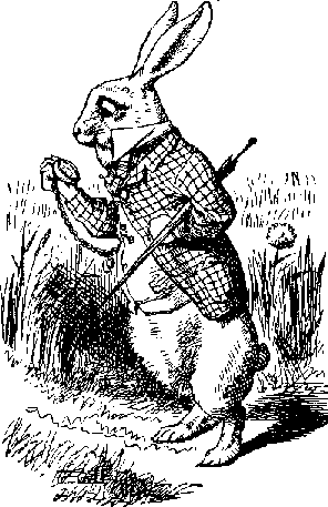
http://z-m-l.com/go/alice/checking_watch.png
http://z-m-l.com/go/alice/checking_watch.png
http://z-m-l.com/go/alice/cat_fades.png
http://z-m-l.com/go/alice/cat_fades.png
http://z-m-l.com/go/alice/alice_cramped.png
http://z-m-l.com/go/alice/alice_cramped.png
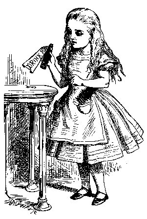
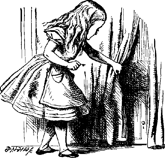
http://z-m-l.com/go/alice/alice_holding.png
http://z-m-l.com/go/alice/alice_holding.png
?? is this the place to discuss the “.” lines?
chapter 10
footnotes and endnotes
some long-form documents have footnotes.[1]
z.m.l. can handle footnotes.
http://z-m-l.com/go/alice/alice_holding.png
http://z-m-l.com/go/alice/alice_holding.png
chapter 11
images in your document
in printed-books, pictures can be very expensive. but in e-books, they come along for “a free ride”, more or less. mount your image-files on the web, and then just enter the u.r.l. to have ‘em pulled in.
that’s right, all you need to do is list the image u.r.l.
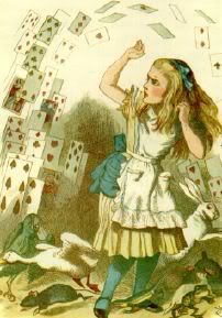
“what is the use of a book,” thought alice, “without pictures or conversation?”
http://z-m-l.com/go/alice/checking_watch.png
http://z-m-l.com/go/alice/checking_watch.png
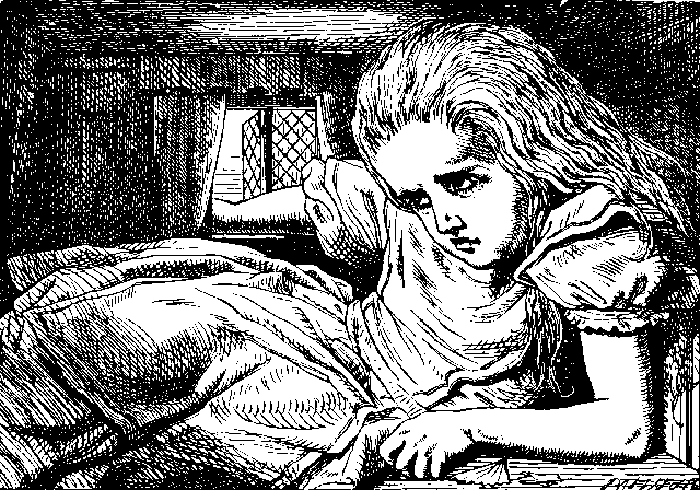
z-m-l can show images.
http://z-m-l.com/go/alice/alice_cramped.png
http://z-m-l.com/go/alice/alice_cramped.png
“what is the
use of a book,”
thought alice,
“without pictures
or conversation?”
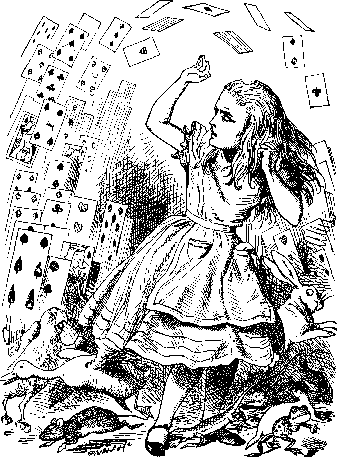
http://z-m-l.com/go/alice/cat_fades.png
http://z-m-l.com/go/alice/cat_fades.png
you can pull an image from your dropbox.
you can pull an image from imgur.
http://i.imgur.com/56QhP4Al.jpg
http://i.imgur.com/56QhP4Al.jpg
you can pull an image from droplr.
http://ckyp.us/aXFG.png
http://ckyp.us/aXFG.png
you can pull an image from github.
you can pull an image from anywhere on the web. isn’t the open web a beautiful thing?
chapter 14
links in your document
the web has taught us the utility of links in a document, which is good.
so, to put a link in your document, just put the u.r.l. that’s it. nothing else is necessary. just put the u.r.l.
at the same time, however, z.m.l. is meant for long-form documents, where we generally want a reader to stick with the document, and not constantly leave to hopscotch the web.
so we want to make it slightly less easy to leave the document, just a bit.
in addition, some people consider an unadorned u.r.l. to be rather unsightly, and they want to “hide it” behind a link.
so, in order to achieve those two things, you can put a link in a footnote if you like. when the reader clicks on a footnote that contains a u.r.l., it is displayed to them, and a second click will open that link.
in addition, to further “beautify” things, you can eliminate the brackets around the footnote reference in the body text. this has the additional functionality that every instance of the footnote which occurs in the body text will be auto-linked.
so, for instance, if you want the word “amazon” to link to http://amazon.com, just make the regular link in the footnote section, where a chunk starts with “amazon” in brackets, and then follows with the u.r.l., and then every time the word “amazon” occurs in your text, it’ll be turned into a link.
***
in addition to external links, like that, you can also have internal links.
remember how, in chapter 5, we said that the table of contents should be hot-linked to the appropriate spots?
that’s one type of internal link you need. there are several other types as well.
often there are places in a document that reference other locations in the document. in these situations, it’s nice to have a link close to (or on) that reference point which transports the reader to that other location.
for instance, a few paragraphs earlier, we made a reference to chapter 5. if a reader clicked on those words — “chapter 5” — they should automatically go to chapter 5.
(and likewise with each of the references to “chapter 5” here in this paragraph too.)
z.m.l. creates such internal links for you, automatically, whenever your text has a verbatim copy of a header, or subheader.
chapter 15
poetry and other silly things
some documents contain poetry, or verse of some type, so your system must be able to handle silliness like that.
some poems want to be left-justified, so you should be able to handle that:
a haiku for you
(by bowerbird intelligentleman)
haiku have three lines
and seventeen syllables
five, seven, and five
other poems want to be centered instead:
t.v. will eat you
(by bowerbird intelligentleman)
t.v. will eat you
out of a satellite dish
with a tuning fork
and some poems want to alternate...
six spaces at the start of this line
12 spaces at the start of this line
six spaces at the start of this line
12 spaces at the start of this line
six spaces at the start of this line
12 spaces at the start of this line
six spaces at the start of this line
12 spaces at the start of this line
and some poems want to get fweaky!
six spaces at the start of this line
ten spaces at the start of this line
14 spaces at the start of this line
18 spaces at the start of this line
22 spaces at the start of this line
26 spaces at the start of this line
22 spaces at the start of this line
18 spaces at the start of this line
14 spaces at the start of this line
ten spaces at the start of this line
six spaces at the start of this line
in general, lines of a poem prefer to stay together, that is, to be kept all on a page whenever possible, so your system should attempt to accomplish that...
if it’s not possible to keep the whole poem on a page, try to make the page-break occur between the verses...
chapter 16
tables in your document
z.m.l. is focused on non-tech writers more than tech writers — literature and not spreadsheets — but it can nonetheless handle tables fairly well; maybe not hairy ones, but straightforward ones.
the tag for tables is “|”.
| table 1 | column 1 | column 2 |
| plain-text | yes | yes |
| x.m.l. | no | yes |
| html | yes | no |
| .rtf | no | yes |
| no | no |
the column-entries in each row can be separated by a sequence of at least 3 spaces, as well, if you prefer. that is, the internal column indicators are optional.
| table 1 | column 1 | column 2 |
| plain-text | yes | yes |
| x.m.l. | no | yes |
| html | yes | no |
| .rtf | . | yes |
| no | no |
because all of the spaces around it ware collapsed, as you can see in the table above, an “empty” cell must be indicated by entering a single period in it.
it’s not necessary to “line up” the tables, nor do you need the or-bar indicator at the end of each row.
| table 1 | column 1 | column 2 |
| plain-text | yes | yes |
| x.m.l. | no | yes |
| html | yes | no |
| .rtf | . | yes |
| no | no |
again, it’s not necessary to line up” the columns, just as long as three spaces separate each column.
| table 1 | column 1 | column 2 |
| plain-text | yes | yes |
| x.m.l. | no | yes |
| html | yes | no |
| .rtf | . | yes |
| no | no |
pull in the major-league standings tables ??
chapter 17
epigraphs and epitaphs
there’s an old proverb
that says just about
whatever you want it to...
— slashdot
sometimes a chapter starts with a nice pithy quote, which is usually italicized, and often right-justified.
this is the kind of thing that is thus easy to pull off.[2]
chapter 18
hyphens and dashes
the first - called an “en-dash” - is narrow. the second — called an “em-dash” — is wider; it’s called that because it’s as wide as an “m”.
you’ll generally use an em-dash, not an en-dash.
there is no em-dash in the lower-ascii codes so can use a double-dash and z.m.l. will convert it.
some style-guides say you should not put spaces on the sides of a dash. that’s wrong. the dash looks nicer with spaces around it.
even more importantly, the search capability of some programs is thwarted by a lack-of-spaces; so is the rewrapping routines in some programs. so it’s best if you do put spaces around dashes.
chapter 19
hyphenation stinks
hyphenation is another thing that messes up e-book search capabilities. e-books don’t need hyphenation. turn hyphenation off when you make an e-book.
chapter 20
spaces after a sentence
i’ve been a (proud) 2-space person my whole life.
but z.m.l. only needs one space after a sentence.
and that’s a whole lot easier when you’re writing.
so while you’re writing your e-book, just use one.
chapter 21
multi-purpose block-quotes
sometimes you want to quote a whole block of stuff from someone. this is often called a “block-quote”. clever, the guy who came up with that name...
z.m.l. can do block-quotes.
indeed, there are several ways to tag a block-quote.
here’s an example, using the “>” tag:
dear leslie,
how are you? i am fine.
the weather is nice here.
but i wish it was half
as beautiful as you are.
and i wish you were here.
love,
bowerbird
typically, block-quotes are indented on both the left and right sides.
here’s another block-quote, from a speech; this one is also marked with right-brackets.
four score and seven years ago, our
forefathers set forth upon this continent
a new nation, conceived in liberty and
dedicated to the proposition that
all men[3] are created equal.
here’s another block-quote, from a speech; this one is marked with colons.
ask not what your country can do for you. ask what you can do for your country.
here’s another block-quote, from a speech; this one is marked with semi-colons.
four score and seven years ago, our forefathers set forth upon this continent a new nation, conceived in liberty and dedicated to the proposition that all people are created equal.
and finally, let’s repeat that first block-quote; but this time it’s marked with carets, meaning that it will be displayed larger, as a pull-quote.
four score and seven years ago, our forefathers set forth upon this continent a new nation, conceived in liberty and dedicated to the proposition that all people are created equal.
there are many other different situations that might have need for this type of indentation. for now, we will call them all “block-quote”. perhaps later we will see fit to break out a more finely-grained analysis, if we find cases so special they merit their own class.
chapter 22
the play is the thing
z.m.l. can do plays, where character-names can be offset to the left of their dialog.
dale: that’s not what p.g. is all about.
bowerbird; i think it’s important to give people a good e-book experience.
dale: that’s your opinion.
bowerbird; yes it is.
steve. (weakly) i can’t...
dale: no it isn’t.
steve. (weakly) get a...
bowerbird; is too.
steve. (weakly) word in edgewise...
dale: is not.
lurkers/ will you two cut it out?
bowerbird; is so.
dale: is not...
(fade) to black.
as you can see above,[4] there are five different ways that this structure can be marked: with a colon, semi-colon, slash, period, or parentheses. we will determine which of these differentiations is useful and will be retained, and which are not.
colon: the colon is one way to indicate a play.
semi-colon; the semi-colon is another.
slash/ you can also use a slash if you prefer.
period. plus there is the venerable old period.
(parens) parentheses, too, which must be in pairs, to accomodate a balancing-check for paired items.
gotta be able to handle plays. dialog, instructions to actors, stage directions, that kind of stuff...
the other type of place where you see this type of formatting is in interviews.
q: what is the answer?
a: that’s a good question.
chapter 23
lists in your book
i like lists. z.m.l. can do lists. here’s a list:
- one (using asterisks)
- two (using asterisks)
- three (using asterisks)
- four (using asterisks)
- five (using asterisks)
- six (using asterisks)
- seven (using asterisks)
- i forget what 8 was for.
- number 9, number 9...
sometimes you want a numbered list...
here’s an example of a numbered list, with the number specifically included.
- 1. one, numbered, specifically
- 2. two, numbered, specifically
- 3. three, numbered, specifically
- 4. four, numbered, specifically
- 5. five, numbered, specifically
- 6. six, numbered, specifically
- 7. seven, numbered, specifically
- 8. i still forget what 8 was for.
- 9. number 9, number 9...
here’s another numbered list, again with the number specifically included, where we mix things up a bit...
- 101. one, numbered, mixed
- 202. two, numbered, mixed
- 333. three, numbered, mixed
- 4444. four, numbered, mixed
- 55555. five, numbered, mixed
- 6. six, numbered, mixed
- 77. seven, numbered, mixed
- 88. i still forget what 8 was for.
- 9. number 9, number 9...
here’s another numbered list, except this time it’s an .html “ordered list”, so the browser does the numbering...
- one, regular “ordered” list
- two, regular “ordered” list
- three, regular “ordered” list
- four, regular “ordered” list
- five, regular “ordered” list
- six, regular “ordered” list
- seven, regular “ordered” list
- i still forget what 8 was for.
- number 9, number 9...
here’s another example of a list:
- mercury (using o for tag)
- venus (using o for tag)
- earth (using o for tag)
- mars (using o for tag)
- jupiter (using o for tag)
- saturn (using o for tag)
- uranus (using o for tag)
- neptune (using o for tag)
- pluto (using o for tag)
here’s another example of a list:
- mercury (using = for tag)
- venus (using = for tag)
- earth (using = for tag)
- mars (using = for tag)
- jupiter (using = for tag)
- saturn (using = for tag)
- uranus (using = for tag)
- neptune (using = for tag)
- pluto (using = for tag)
here’s another example of a list:
- mercury (using + for tag)
- venus (using + for tag)
- earth (using + for tag)
- mars (using + for tag)
- jupiter (using + for tag)
- saturn (using + for tag)
- uranus (using + for tag)
- neptune (using + for tag)
- pluto (using + for tag)
here’s another example of a list:
- mercury (using - for tag)
- venus (using - for tag)
- earth (using - for tag)
- mars (using - for tag)
- jupiter (using - for tag)
- saturn (using - for tag)
- uranus (using - for tag)
- neptune (using - for tag)
- pluto (using - for tag)
- here’s another example of a list:
- mercury (with a mix of tags)
- venus (with a mix of tags)
- earth (with a mix of tags)
- mars (with a mix of tags)
- jupiter (with a mix of tags)
- saturn (with a mix of tags)
- uranus (with a mix of tags)
- neptune (with a mix of tags)
- pluto (with a mix of tags)
include stuff on a definition list ??
chapter 24
make your own breaks
there are several types of breaks that you can create.
***
a three-asterisk chunk serves as a scene-break.
***
a six-asterisk chunk serves as a column-break.
***
a nine-asterisk chunk serves as a page-break.
page-breaks become slighly dangerous in a reflowable environment like e-books, because you don’t know the size of the screen “page”, so you might be toward the top of one already, in which case a page-break will cause that page to be very short. so try to use them sparingly.
chapter 26
cascading colliding styling
let’s talk about stylesheets. zen markup language is fully dedicated to making life easier for writers. because writing itself is hard enough. it really is.
and asking writers to get involved in the quicksand that c.s.s. has become would be antithetical to that.
nonetheless, writers want their stuff to “look good”. so we give them the ability to futz with their c.s.s. we’re gonna try our best to make it easy, of course, and we’re gonna put up a fence when it starts to get more complicated than we know would be good, and we have a pretty good idea when that time will come, so you’re just gonna have to trust our judgement on it.
chapter 27
the meta-data chapter
a lot of people think “meta-data” is important. i think they’re full of poop, but why not make ‘em happy?
so give them their own section — call it the “meta-data section” — and then let them put whatever makes ‘em happy into that section.
you will find the meta-data section toward the very end of this document, where it belongs, after the “real” data.
chapter 28
the end of this test-suite
we hope you’ve enjoyed this test-suite document; if you have any questions, feel free to ask them.
this is a draft, so please suggest improvements.
have a nice day.
the end.
the notes section
here are the footnotes/endnotes.
[1] personally, i don’t think we need to make a distinction between footnotes and endnotes any more. i believe that all the types of notes should be stored at the end of the file, like these notes, but i think the person should be able to display them at the point of reference in the actual body of the text. therefore, they are actually a sort of hybrid between footnotes and endnotes, combining the strengths and convenience of both types. ^^1^^
[2] this is a test footnote. because of that, it’s going to go on and on and on. this is a test footnote. because of that, it’s going to go on and on and on. this is a test footnote. because of that, it’s going to go on and on and on. this is a test footnote. because of that, it’s going to go on and on and on. this is a test footnote. because of that, it’s going to go on and on and on. ^^2^^
look, it even has a second paragraph! this is a test footnote. because of that, it’s going to go on and on and on. this is a test footnote. because of that, it’s going to go on and on and on. this is a test footnote. because of that, it’s going to go on and on and on. ^^2^^
oh no! a third paragraph. way too long! this is a test footnote. because of that, it’s going to go on and on and on. this is a test footnote. because of that, it’s going to go on and on and on. this is a test footnote. because of that, it’s going to go on and on and on. this is a test footnote. because of that, it’s going to go on and on and on. this is a test footnote. because of that, it’s going to go on and on and on. hasabreak ^^2^^
this paragraph is a separate paragraph; because it is not a continuation of the footnote above, it has two blank lines above, to bump it out as a separate entity.
[3] in later years, it was made clear that lincoln was referring to all “people”, and not just men, that women are equally equal. ^^3^^
[4] this is another test footnote. but it will be short. ooooooo
hasabreak ^^4^^
this paragraph also has two blank lines above it, because it is meant to be separate from the footnote which is directly above it.
[amazon] http://www.amazon.com ^^amazon^^
[beautiful] http://zenmagiclove.com/simple/beautiful.jpg
http://zenmagiclove.com/simple/beautiful.jpg ^^beautiful^^
colophon section
that’s right. we believe in the colophon!
tell people here how to specify their own .css files. ??
the meta-data section
here’s the meta-data...
- title = zen markup language 2015 test-suite
- subtitle = testing the full features of z.m.l.
- author = bowerbird intelligentleman
- purpose = a test-suite
- markup = zen markup language (.zml)
- isbn = urn:isbn:0000000000000
- publisher = jaguar(ps)
- subject = we’re doin’ the test-suite thang
- rights = copyright 2015 — all rights reserved
- file = zenmagiclove.com/zml/sweet/sweet.zml
goodbye!
chapter 31
what bruno must have
these are the things bruno considers essential:
Verizon, Comcast, ATandT, Deutsche Telekom, and 中国电信 do not own the Internet.
- word counter (and partial word counter on partial select):
- check (and more)
- autosave
- check (as an option)
- cloud sync (any service like Dropbox, Github, Gdrive etc is fine)
- check (dropbox, box, s3)
- native spell-check
- check (plus additional customized spell-check)
- user-customizeable document-specific dictionaries
- preview pane
- check. (with dismissal, and various display options)
- easy HTML export
- check. (automatically saved to web-folder at document’s secret url)
- ability to use multiple instances
- check. (put one in whatever folder you like)
chapter 32
nice-to-have
bruno’s list of “would like but aren’t essential” features is:
- super easy file/folder management
- check.
- templates for code export
- you can do that yourself, as my tool is for writers, not coders.
- API for image uploads
- images are pulled into current folder from remote location
- plus images can also be dropped into the browser-window
- images embed directly into edit mode AND preview mode, so...
- you don’t really want images in the edit pane
- ...so scrollbars stay in sync
- we make the scrollbars stay in sync, when you want that...
- draggable UI elements
- you’ve got the .html source, so put stuff where you want it
- Support for mobile devices - at least tablet optimized.
- this is almost entirely a function of intelligent .css
- Export API or open source the entire app
- the entire app is a .js javasqwipt file, so you can customize
- Collaboration and sharing, shared notes/comments
- files exist online, so anyone (with the secret url) can get to them
- TitleCapitalization built into the Title field
- my policy is not to change what you have typed
- Hemingway built into the content area
- open javasqwipt format allows you to do whatever you like
- Mathjax
- can be installed, but not the default
chapter 33
this is chapter 3, where we illustrate how graphics are handled.
http://yuml.me/c9ce39b0.png
http://yuml.me/c9ce39b0.png
http://yuml.me/ee2636c6.png
http://yuml.me/ee2636c6.png
these are just links...
http://lorempixel.com/400/200/sports/my-dummy-text
http://zenmagiclove.com/simple/sch001.png
http://zenmagiclove.com/simple/sch001.png
http://zenmagiclove.com/simple/sch002.png
http://zenmagiclove.com/simple/sch002.png
http://zenmagiclove.com/simple/sch003.png
http://zenmagiclove.com/simple/sch003.png
http://zenmagiclove.com/simple/sch014.png
http://zenmagiclove.com/simple/sch014.png
some tables
| column 1 | column 2 | column 3 | column 4 | column 5 | column 6 |
| row 1 col 1 | row 1 col 2 | row 1 col 3 | row 1 col 4 | row 1 col 5 | . |
| row 2 col 1 | row 2 col 2 | row 2 col 3 | row 2 col 4 | row 2 col 5 | row 2 col 6 |
| row 3 col 1 | row 3 col 2 | row 3 col 3 | row 3 col 4 | d | . |
| row 4 col 1 | row 4 col 2 | row 4 col 3 | row 4 col 4 | d | . |
some pictures
http://zenmagiclove.com/zml/alice/epub/alice.jpg
http://zenmagiclove.com/zml/alice/epub/alice.jpg
| first header | second header |
| —- | —- |
| content cell | content cell |
| content cell | content cell |
for aesthetic purposes, you can also add extra pipes on the ends:
| first header | second header |
| —- | —- |
| content cell | content cell |
| content cell | content cell |
note that the columns don’t have to line up:
| name | desqwiption |
| —- | —- |
| help | display the help window |
| close | closes a window |
you can also include styling, such as bold, italics, and monospaced:
| name | desqwiption |
| . | . |
| help | display the `help` window |
| close | closes a window |
the content in the cells is centered; you can’t control the alignment.
| left-aligned | center aligned | right aligned |
| . | . | . |
| col 3 is | some wordy text | $1600 |
| col 2 is | centered | $12. |
| zebra stripes | are neat | $1. |


